Overview
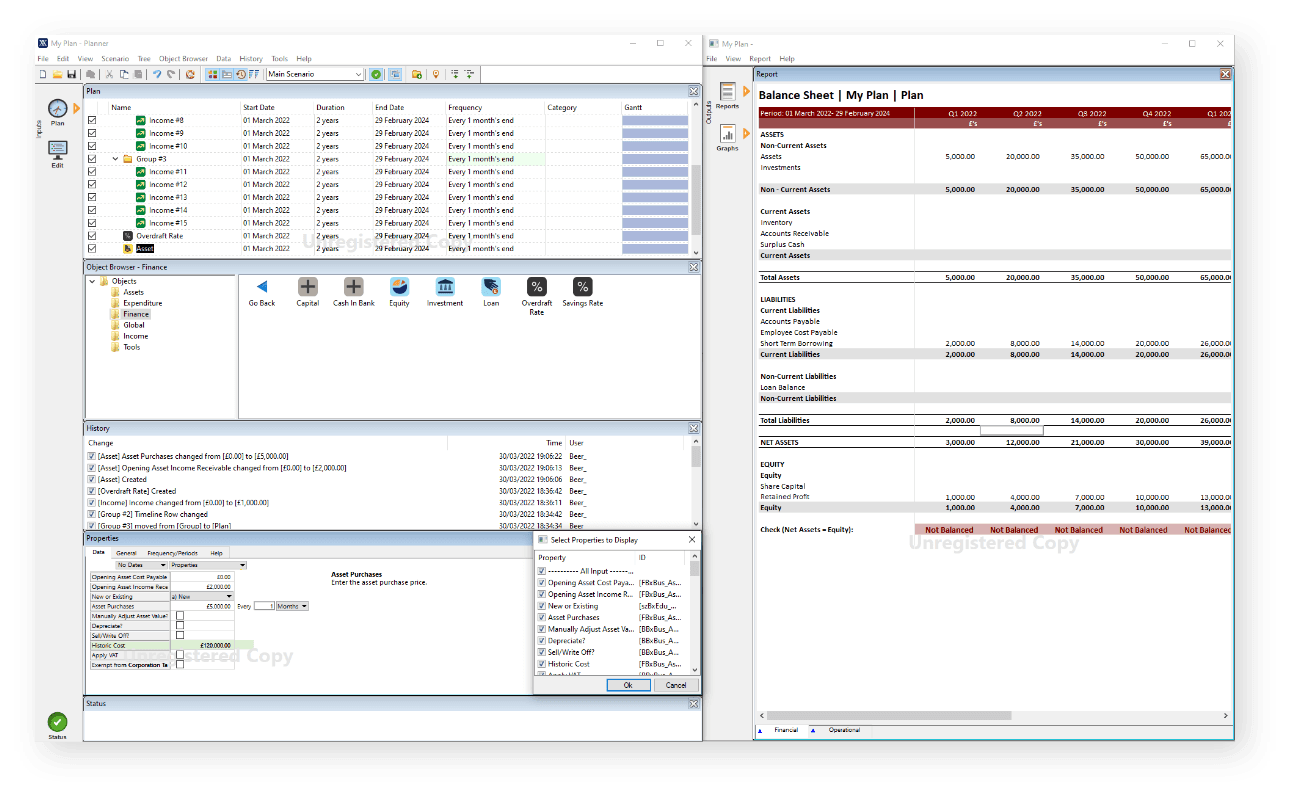
Brixx planner was a 20+ year old C+ based windows application delivering industry-leading financial modelling capabilities. In 2016, my task was to take this powerful but ageing application and translate it into a SAAS based platform with a modern UI.
The original Brixx planner UI I was tasked to redesign
The teams' goals
I was working in a team of financial modelling experts, engineers and product managers. The original platform would normally take 3+ days of training from expert consultants to onboard users. Our ambitious goal was to transform this into a self-serve platform that could be used without any extensive training and could empower startups and business owners.

We also discussed the problem we felt we wanted to solve within the market:
Problem statement
Banks and investors require high-quality financial forecasts from startups and businesses. Business owners don't know how to create these with confidence. Hiring professional services is expensive.Financial planning for professionals is a time-consuming endeavour when attempted in spreadsheets. It's prone to error, not conducive to collaboration and takes too long to generate a range of business scenarios.
Research
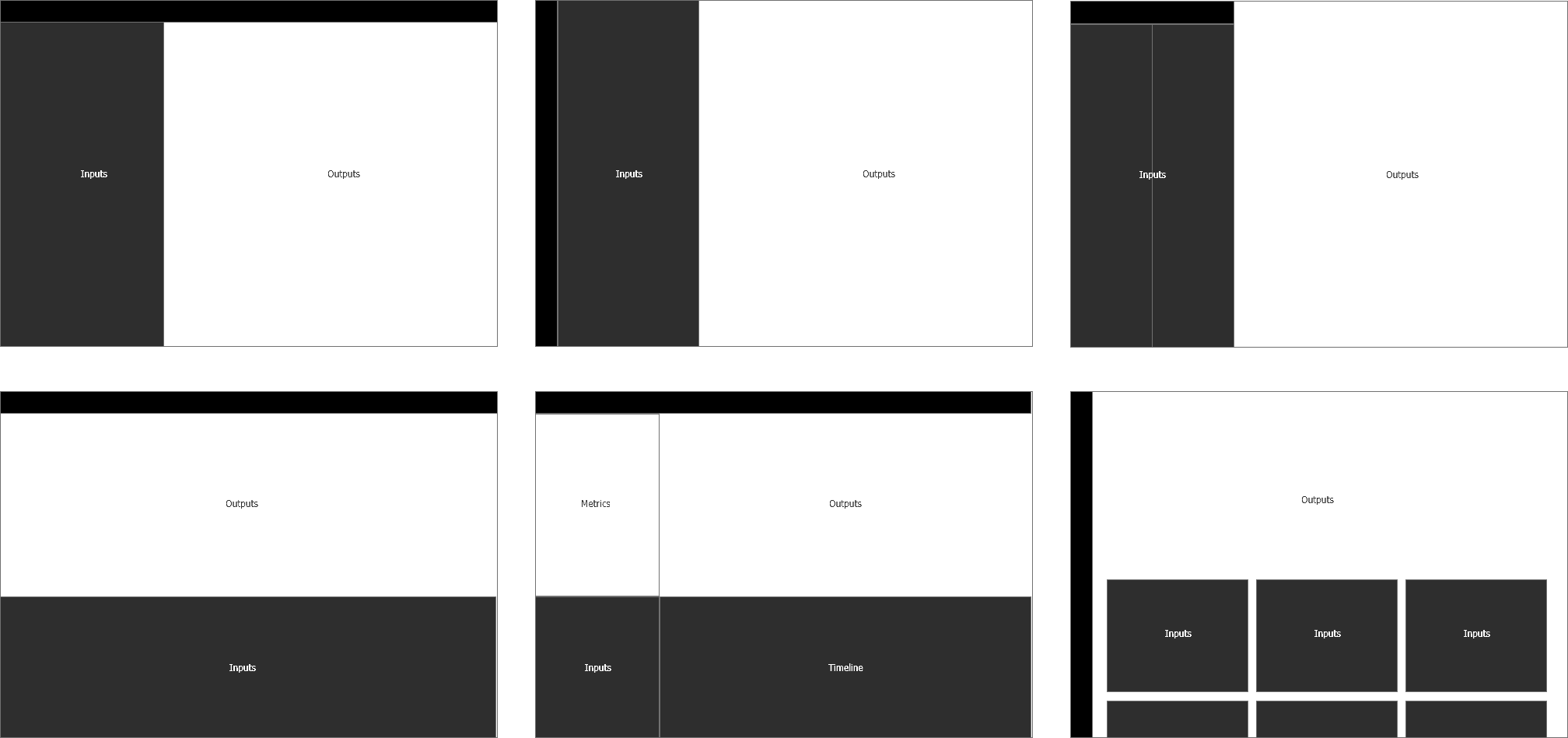
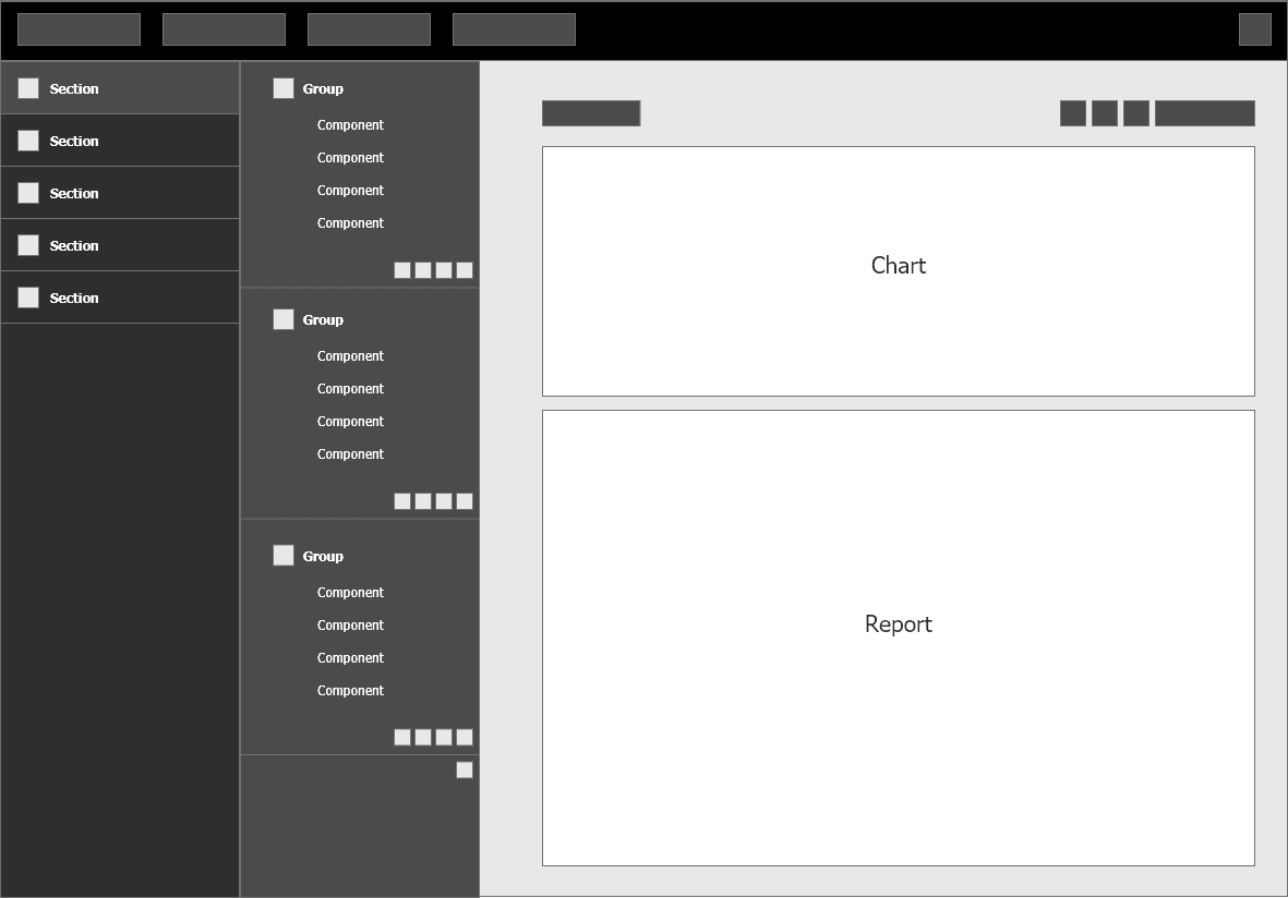
I explored many different ways to adopt this input/output approach in the UI. They would start as quick diagrams to get the idea across to the team. Some of them were moved to higher fidelity states to better understand if they had merit.
Mapping user flows
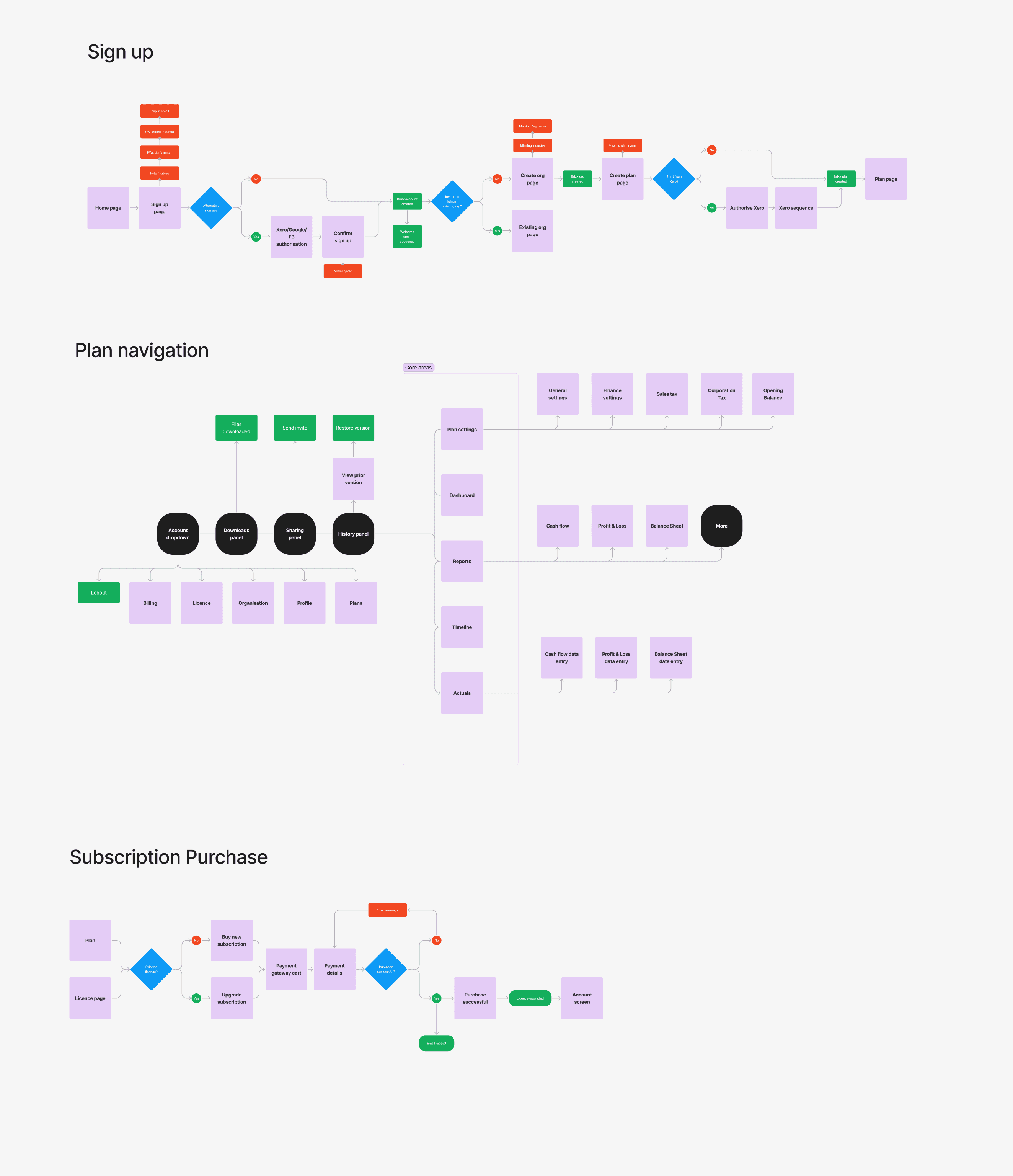
Whilst I was working on the main UI, it was important to understand all the areas we'd need to build and how the users would flow through them. I mapped these in flow and navigation diagrams.
The Brixx design system
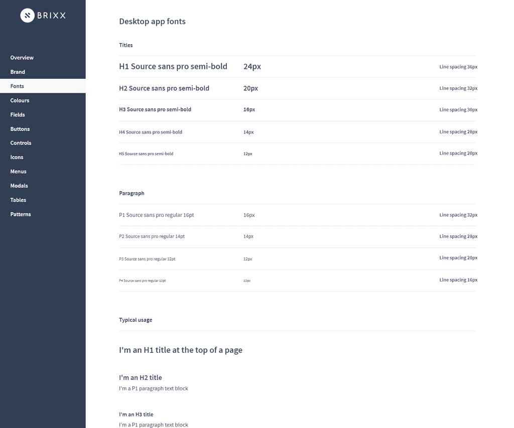
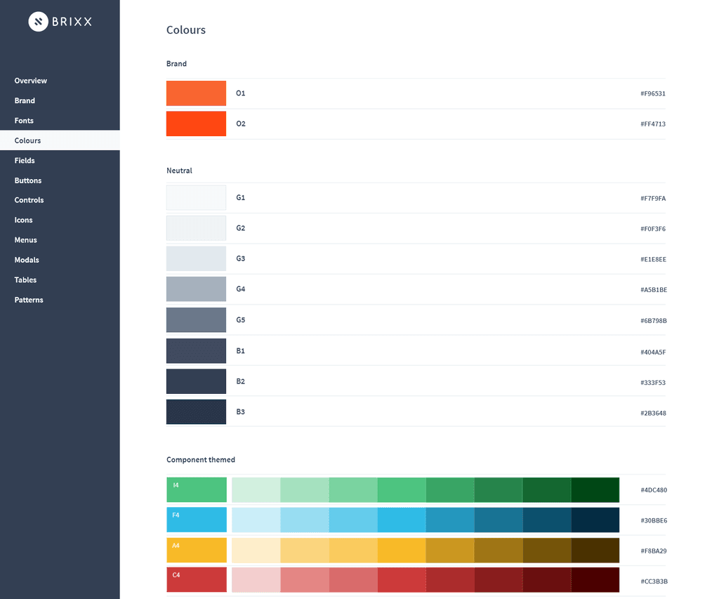
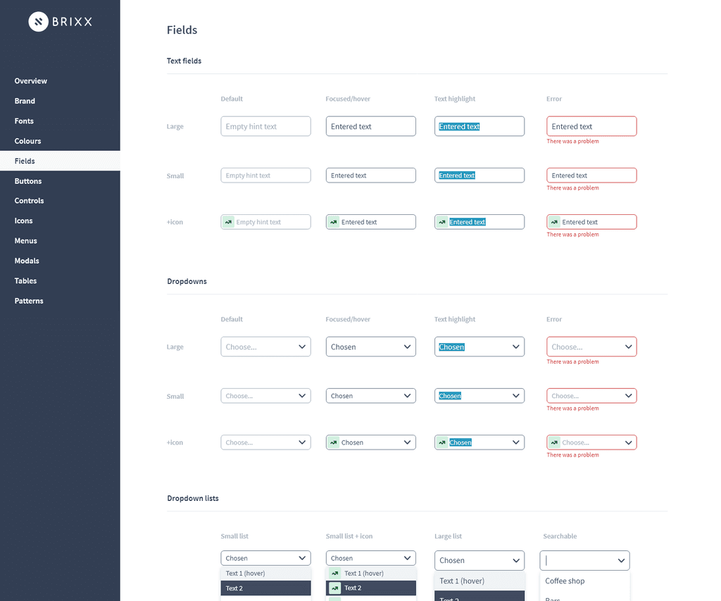
I designed a minimalist, modern UI system adopting atomic principles to make it scalable, expandable and easy for developers to work with.
The Brixx UI
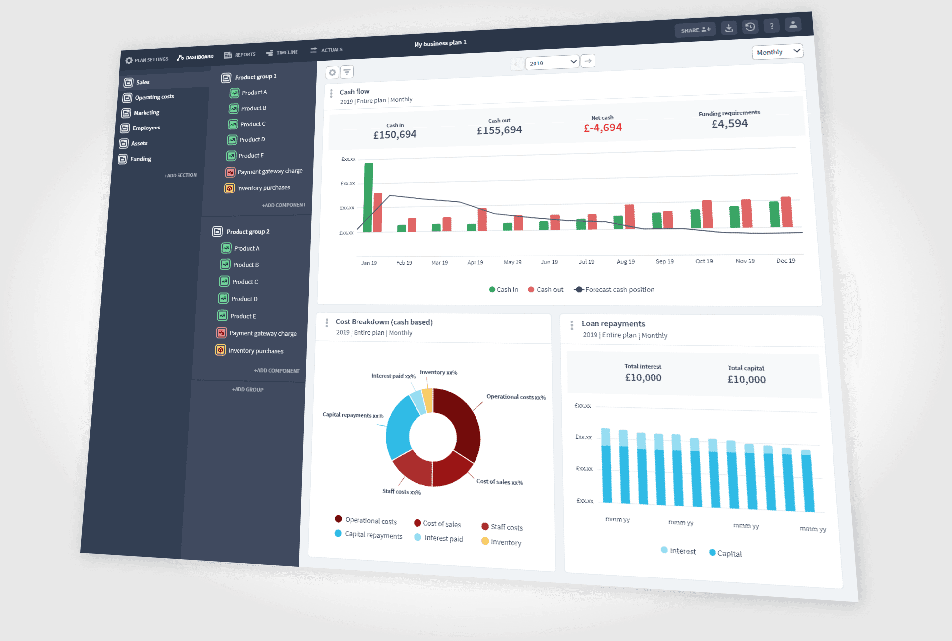
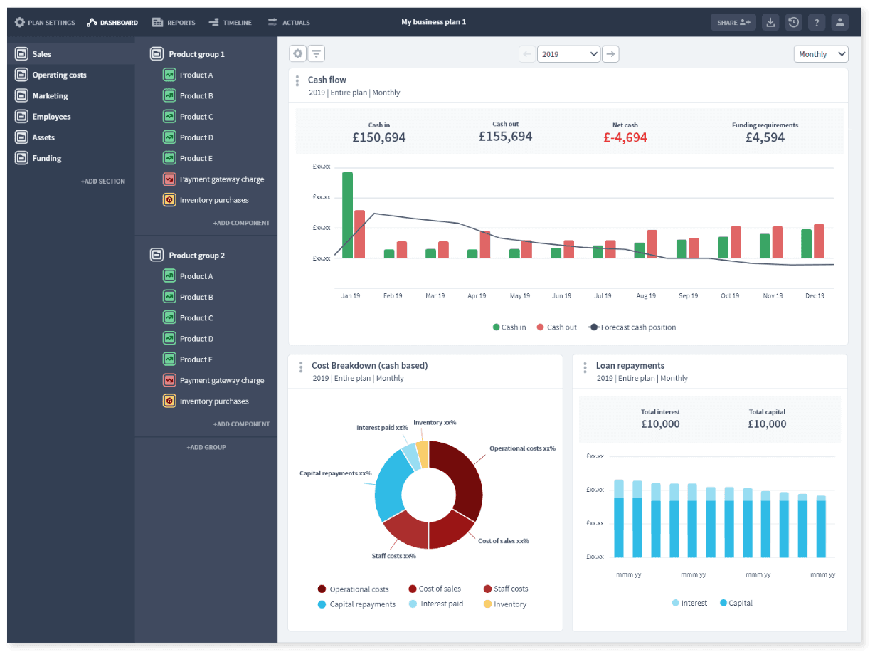
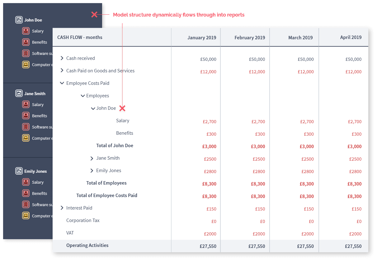
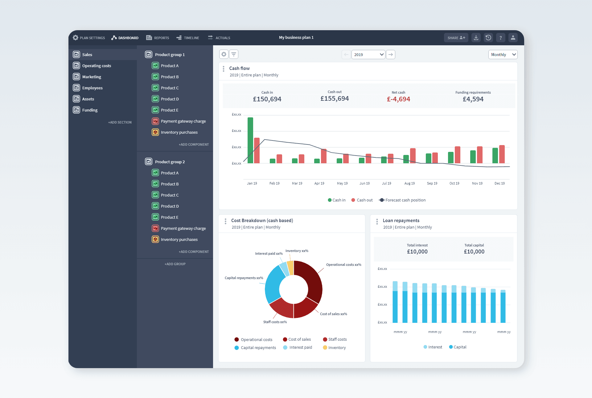
The default landing page for the app is the cash flow dashboard for the user's financial model. We chose this as a friendlier place to start over the more intimidating financial statements. The model inputs appear on the left using colour coded components to represent a business's activities.
Financial building blocks
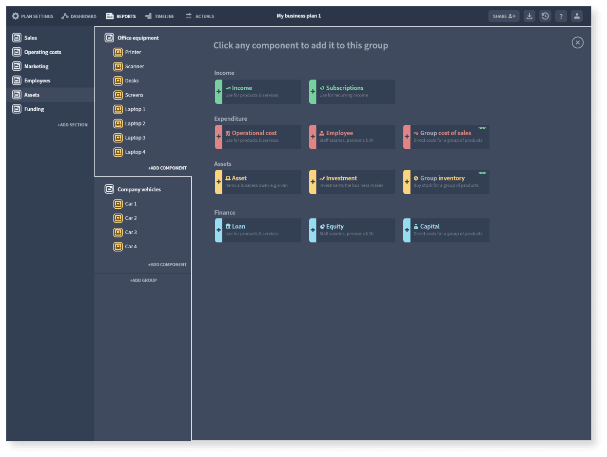
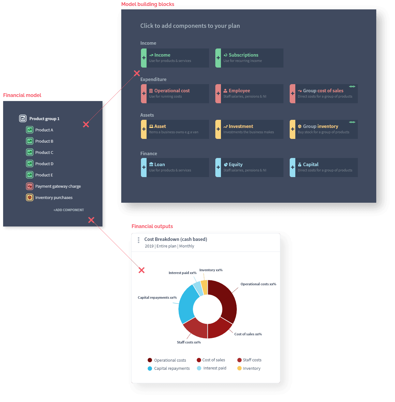
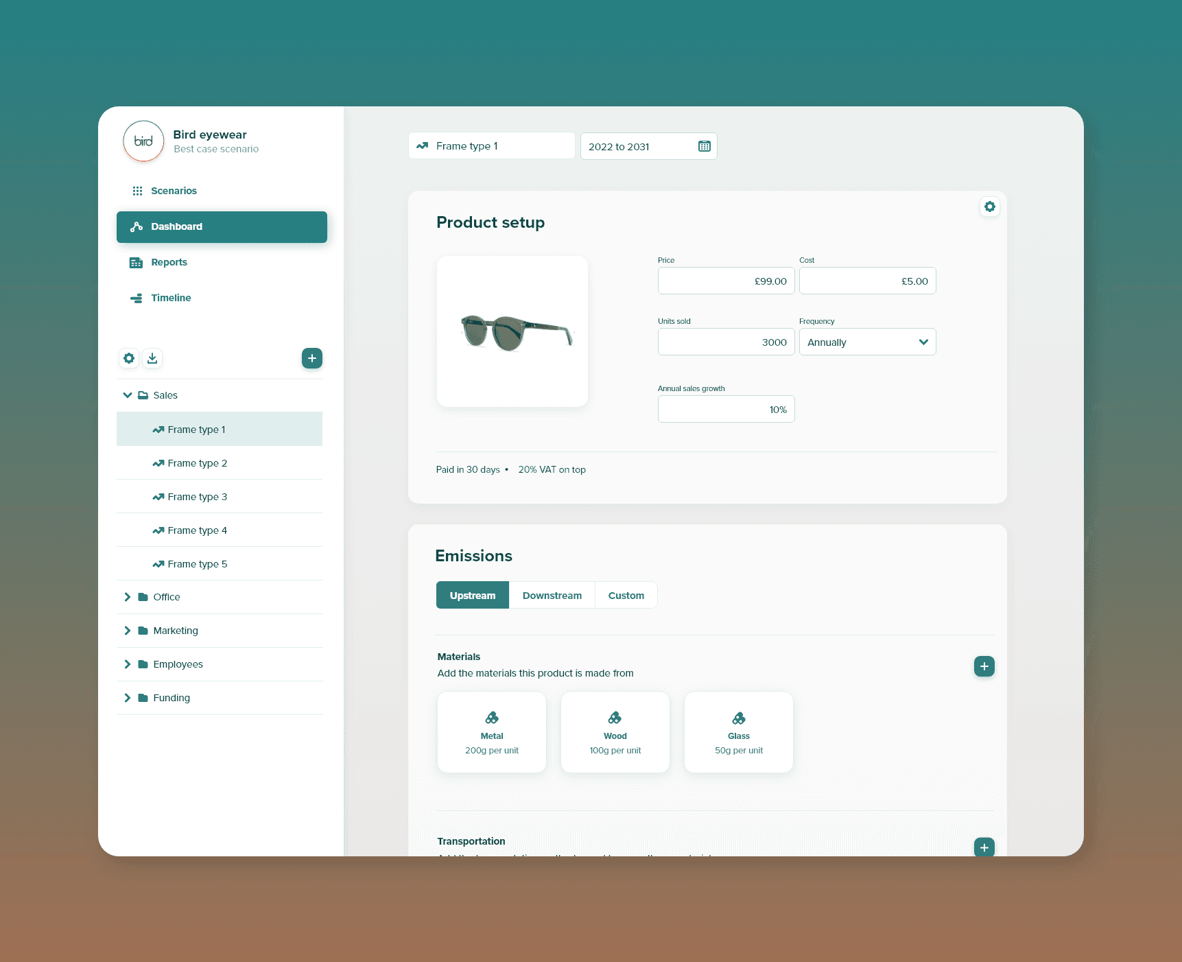
A Brixx model is built from a library of component building blocks. I designed the library as a panel overlaying the model outputs on the right and connected to the group you are adding to. To get a user started quickly I created a simple business template with a range of typical business components to help a user understand the principles.
Visualising activities
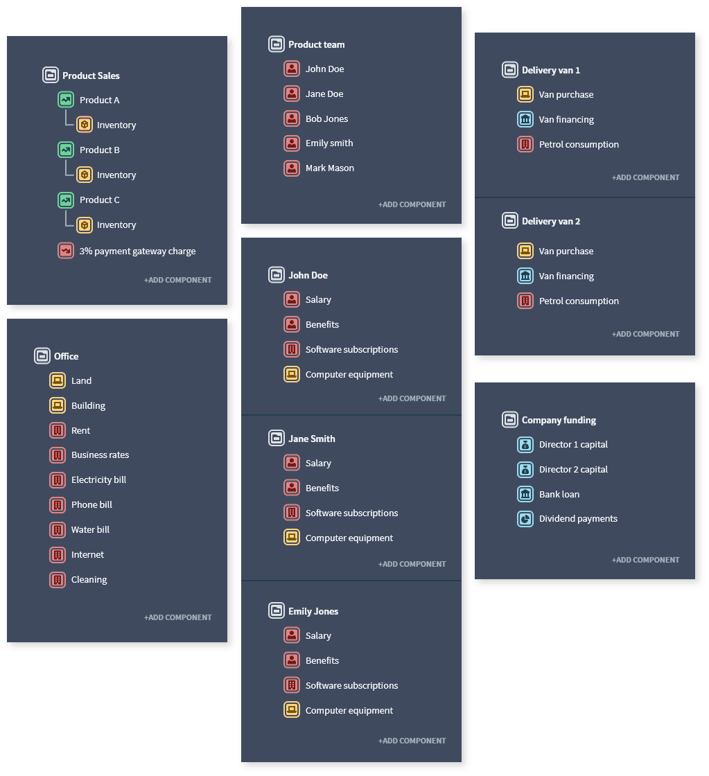
The library allows you to build any combination of components. This is designed so the user can build out their business in a modular way. They add the activities relevant to their specific business and group them in a way that makes sense to them.
All financial or modelling jargon is avoided. Instead, the intent is that users structure their model by real-world activities, organised by how they would express their business 'on a piece of paper'.
Professional reports, built automatically
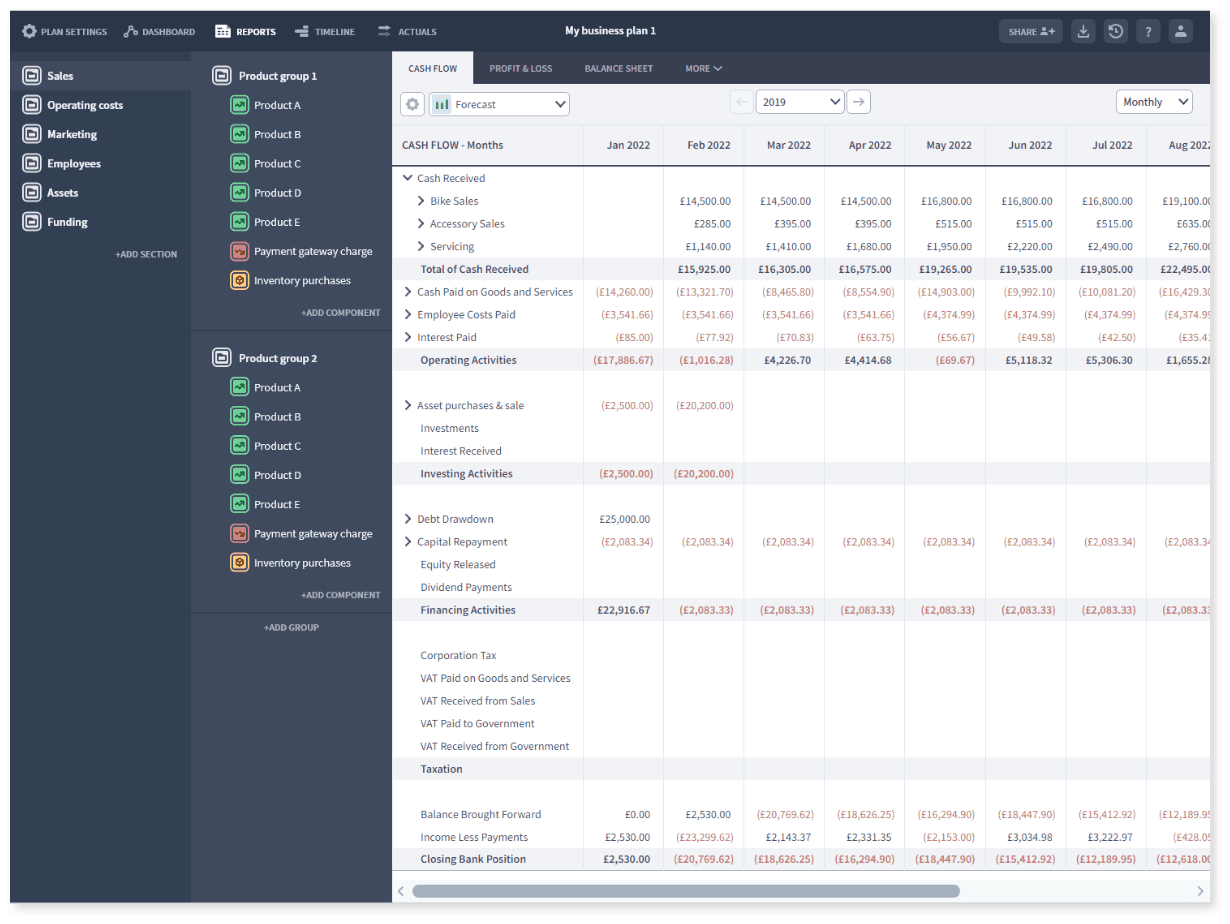
The user can build any model structure they desire and it will still output a complete Cash Flow, Profit & Loss and Balance Sheet without fear of errors. They are generated automatically by the model's inputs allowing any user access to professional-level financial reports for business planning and investment.
Teaching with colour
The components of the model are split into 4 colour themes for income, expenditure, assets and finance.
Every business is built from a combination of these ’lego’ like building blocks. I built colour into these input categories which then flow through to the chart outputs. This helps solidify the connection between what a user inputs in their model and the consequences in their financial outputs.
Contextual help
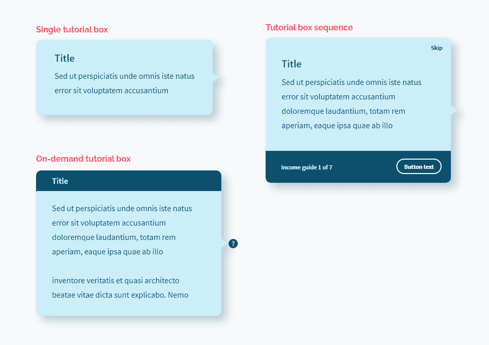
Accounting, modelling and finance is full of difficult terminology and principles. In order to be truly accessible, I built in contextual based help at every opportunity. It was important that the app delivered help ‘on the spot’ so that users were less likely to resort to external guides or customer support.
Time-based scenarios
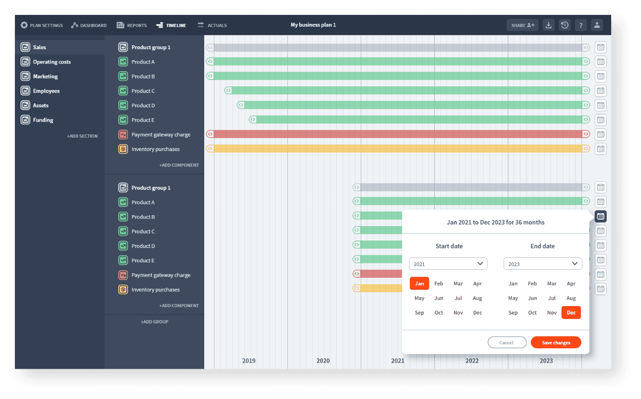
To facilitate testing scenarios around event timing I designed a financial gantt style area. This has the capability of moving financial transactions in time allowing the user to explore the ramifications of a delayed product launch or the timing of different staff hires.
Every change updates all relevant figures across the 3-way model, a task that could take hours and be highly error-prone in a spreadsheet.
