Overview
Since the launch of the Brixx financial modelling app we’d received constant requests to integrate with the top accounting platforms.
🎯 The goal was to provide the complete financial picture of a business, past, present and future within one platform. It would enable analysis of actuals vs forecast and make it easier for users to make informed financial decisions about their business.
The integration would be used to generate new Brixx forecasts from accounting data or to layer in accounting data to an existing Brixx forecast.
Business objectives:
Increase adoption of higher-tier subscription packages
Expand the 'accountancy practice' customer segment
Increase sign-ups from Xero users
Reduce churn by providing more reasons to return to Brixx
User problems:
Existing Brixx users are frustrated by having to manually copy and paste actual data into Brixx
Potential new Xero users are be put off from trying Brixx because of the lack of integration
Actuals vs forecast analysis and reforecasting capabilities were limited
User Research
I worked with a product manager and the customer support team to recruit a beta testing group of 50+ of our existing users to understand the problem and help test the solution. Initially, we sent out surveys and had one on one discussions through calls and emails with certain users.
We had several key accounting and business questions to answer:
How did actuals vs forecast analysis assist with business decisions?
What level of detail did Xero users want to conduct actuals vs forecast at?
Did Xero users want to forecast at their chart of account code line items or at a different level?
Do Xero users only care about Cash flow forecasts, or are P&L and Balance Sheet forecasts useful too?
How often would they want to reforecast and how do they roll forward a forecast?
Here's what we learnt 🧠
👉 Xero account structures can be messy
Many users didn’t want to forecast in the same structure as their accounts. Account structures were often created for tax reasons or had legacy bloat making them suboptimal for operational decision making.
👉 Users are still mostly using spreadsheets
When we asked about their current tools, spreadsheets were common. Only a few users were adopting competitor tech solutions like Futrli (and had some frustrations with them).
👉 Forecasting should be granular
Many users wanted to model their business in more detail in Brixx than the granularity of accounts in Xero.
👉 Cash flow is critical
The most critical financial metrics users wanted to see were cash in/out and bank balance. Some users were also interested in Gross, Operating and Net Profit too.
👉 Forecasts should start from historical data
Users wanted to base their forecast on recent historical performance from Xero data.
👉 Analyse the data every quarter
The most common frequency of actuals vs forecast analysis is quarterly. Less people were doing yearly and some wanted monthly.
Accountants and advisors pain points
In addition to serving business owners directly, we also wanted to learn about the accountants and advisors working with these owners. What were their specific problems?
They can sell fewer consultancy hours for tax/payroll because Xero is automating it
They are looking for more value add services like business planning, strategy and financial goals
They are trying to onboard new clients and retain existing clients
Looking to offer ‘cloud based’ accounting - escape offline spreadsheets
Act as the business virtual CFO, FD
Advisor websites offering services related to accounting, forecasting and business planning. They would often market the technologies they were using (such as Xero) to demonstrate their modern, forward thinking approach.
Competitor Research
As Xero has a rich app marketplace there were plenty of opportunities to research how data connections had been handled by others. We had several competitors and products within the financial reporting space.
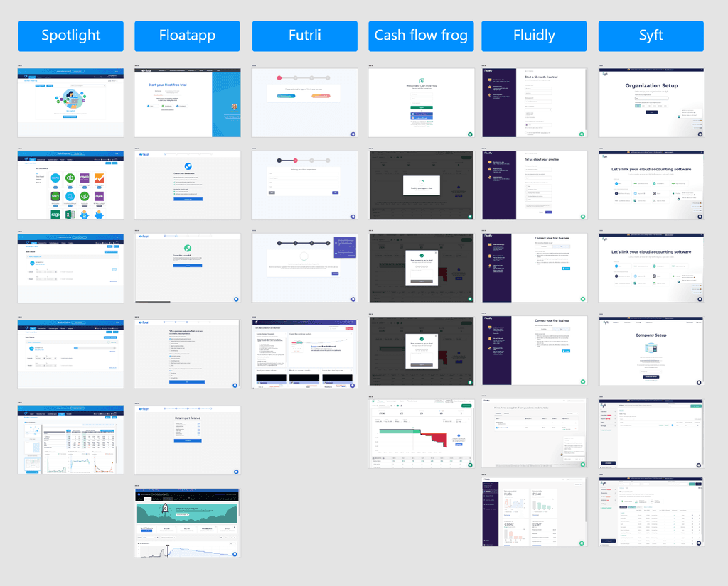
I gathered together the flows of several relevant products for the team to learn from. We were particularly interested to see how companies handled initial set up and then further data sync ups.
All products had setup sequences that averaged 5 or more pages. We didn't want to presuppose that we needed a sequence but it was useful to know that they could work effectively and that users would tolerate them.
🚀 The opportunity we identified (which also lined up with our user research) was to offer more flexibility than our competitors. Existing products were mostly 100% locked in to the user chart of account structure in Xero. This was often frustrating for users.
Ideation
From our research we set out the following design goals:
Forecasting structure needs to be flexible and not locked to the Xero account structure
Account mapping must be simple and seamless
Actuals vs forecast must be easy to analysis
We also had some basic functionality that needed to be fulfilled:
Connection and import
Data structure and visualisation
Brixx model component creation
Post setup synchronisation
Our competitors all used a setup and account mapping flow and we didn’t think there was any need to reinvent the wheel here. We did need a new flow for connecting an existing Brixx forecast to Xero.
However, the area we were scratching our heads around was the actuals vs forecast analysis. The challenge was a little bit technical accounting-y but this is the crux of it:
Detailed actuals vs forecast analysis requires Xero accounts to be mapped to Brixx forecast components. However, to maintain the sandbox like flexibility of testing financial scenarios in Brixx, the forecasting structure needs to break out of this mapping. A tricky contradiction! 🤔
I sparred with our product manager over this problem over many caffeine fuelled white boarding sessions. We managed to come up with a flexible data mapping structure that could accommodate the best of both worlds and wouldn’t give our lead engineer a heart attack.
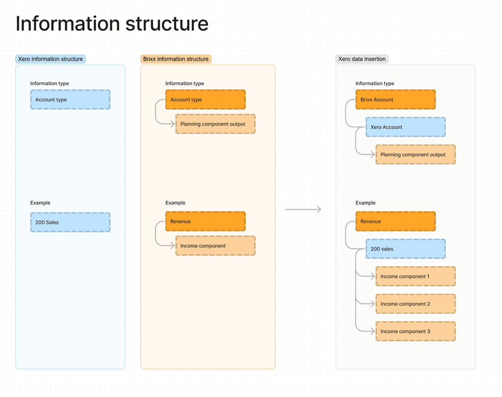
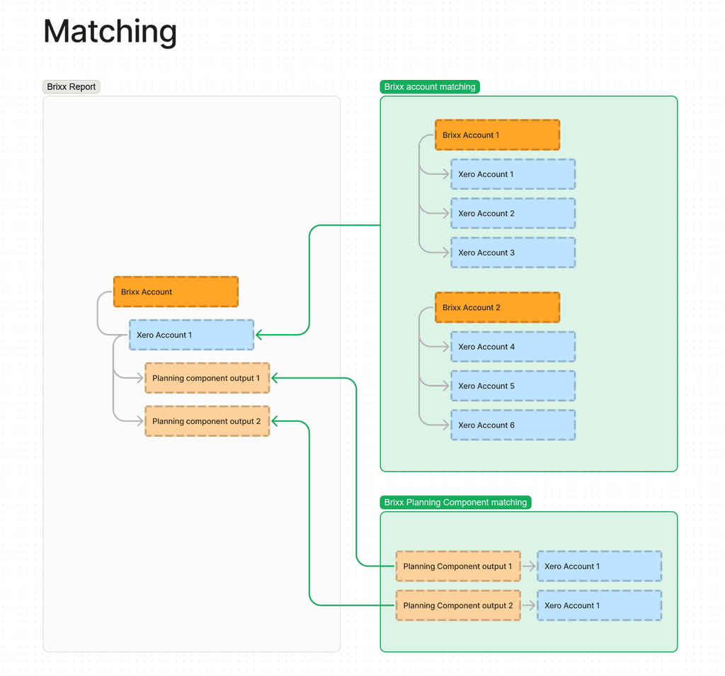
Say hello to ‘flexible mapping’ - a system where users could map accounts one to one, one to many or not at all. 🎉
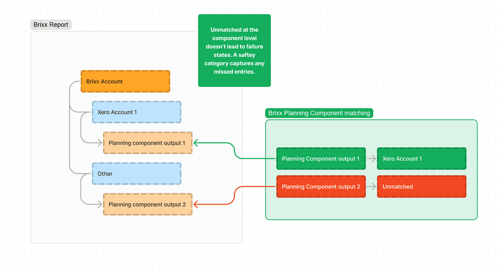
The flexible mapping structure we came up with that would meet the requirements
Just one problem, would users have any clue how to use it?
It was a clever solution but there was potential for confusion and it might be arduous to setup.
With these concerns in mind, we setup some new boundaries for ourselves:
Account mapping should be automated where possible
If accounts aren’t 100% mapped the system should cope without falling over
Rapid scenario testing shouldn’t be blocked by having to map back every potential new forecast item
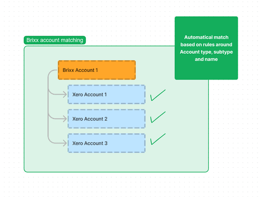
Automated matching where possible
Safety net system means there will always be a top level match of all Xero categories
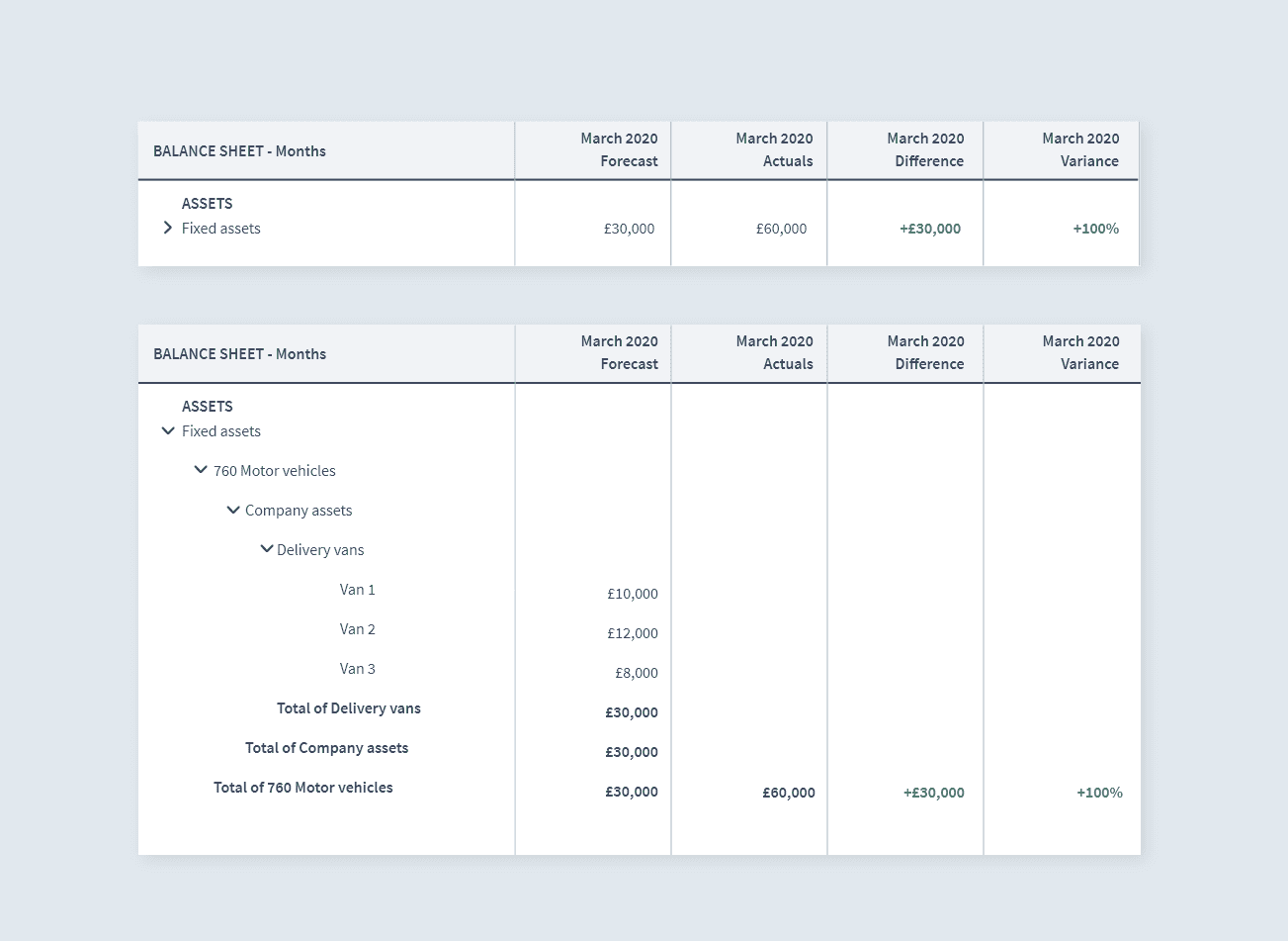
The result of all this behind the scenes magic was to achieve the analytical comparisons our users wanted to see:
An automatic top level match of Fixed Assets enabled the comparison of the forecast value vs the Xero actual value. Drilling into the row would revealed any additional levels of detail from either Xero accounts or Brixx forecasting components.
Visualising the data
With the data structure established, I could explore how we wanted to visualise this data beyond our basic reports to bring the numbers to life. We already had an existing dashboard and set of charts but it needed to be expanded.
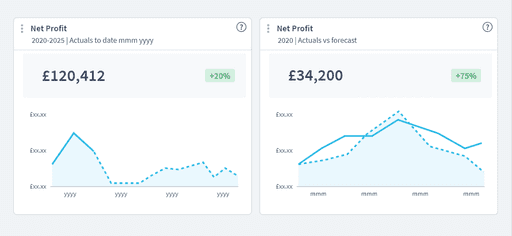
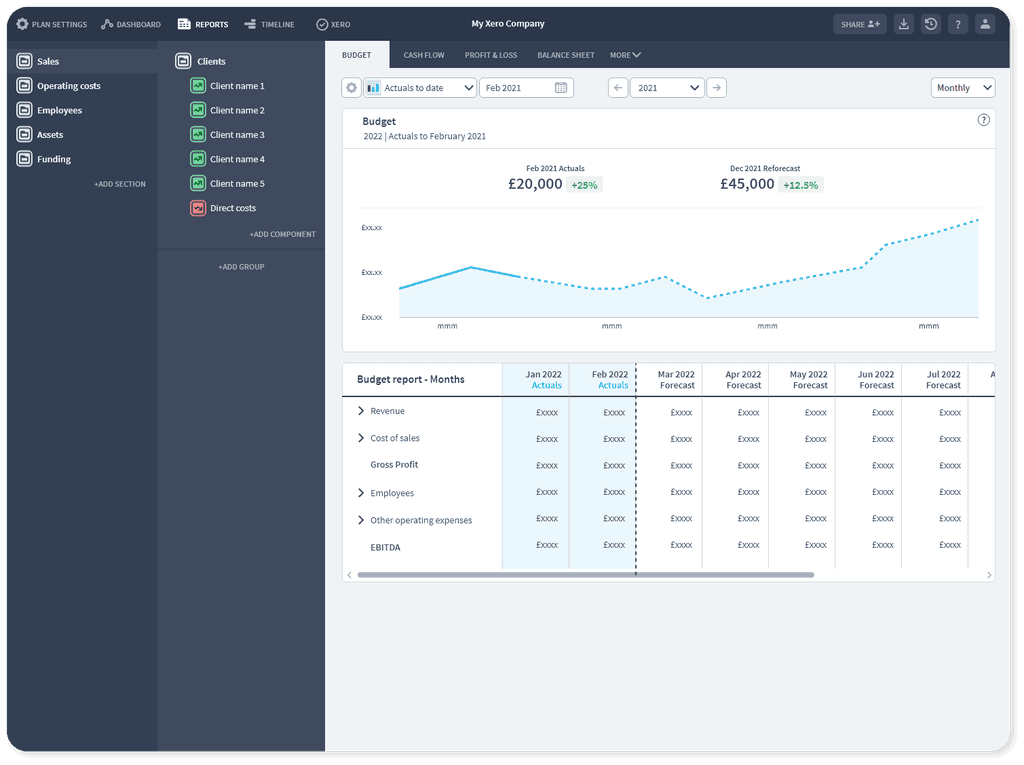
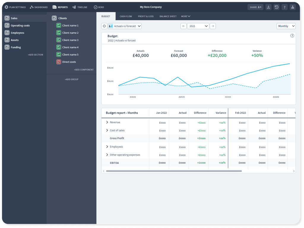
I designed chart components to cover our new cases:
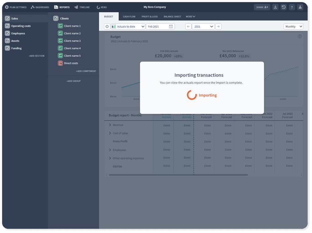
Actuals to date: Actual data followed by the remaining forecast for the period
Actuals vs forecast: All actual data compared to all forecast data for the period
Actuals to date reporting layered in actual months as the year progressed. Users could update their forecast to react to real-life differences.
Actuals vs forecast would show the direct comparison between what the business said they would achieve vs what actually happened.
Xero connection setup flows
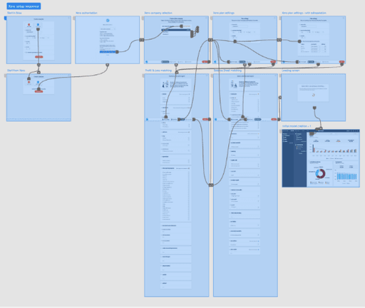
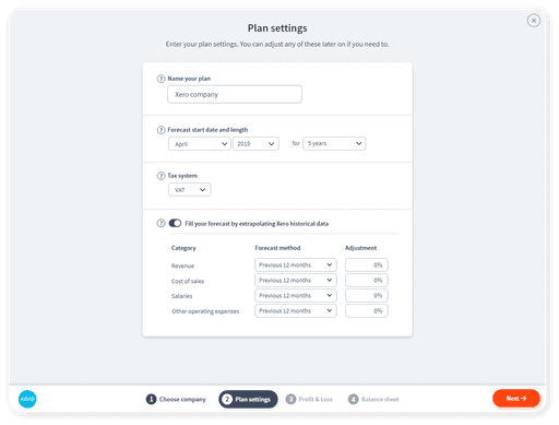
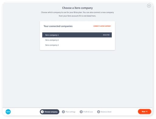
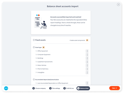
Once we knew how we wanted the data to be represented in reports, we had to work out how it would arrive there in the first place. The matching process was going to need some manual input from the users to confirm that Xero data is correctly aligned to Brixx data.
We had to consider:
Xero authorisation and token handling
Error states and API rate limits
Initial matching of accounts with smart automation + detailed matching
Post connection matching changes and further syncing
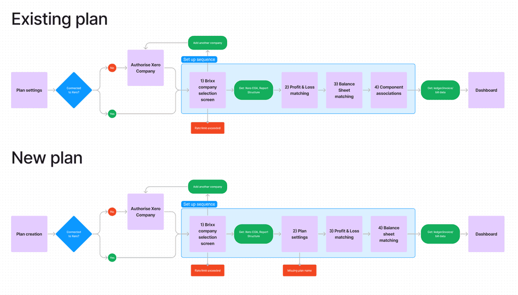
Potentially different order of events:
a) Building a Brixx forecast, then connecting to Xero
b) Connecting to Xero to create a Brixx forecast
Flow diagrams created to map out the two possible API connection paths
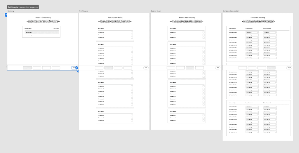
Matching screen wireframes
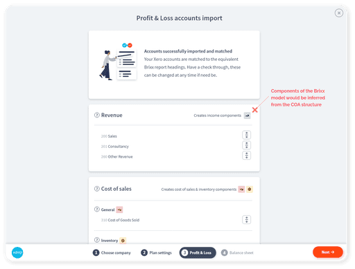
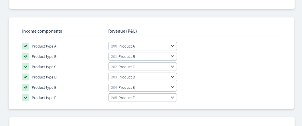
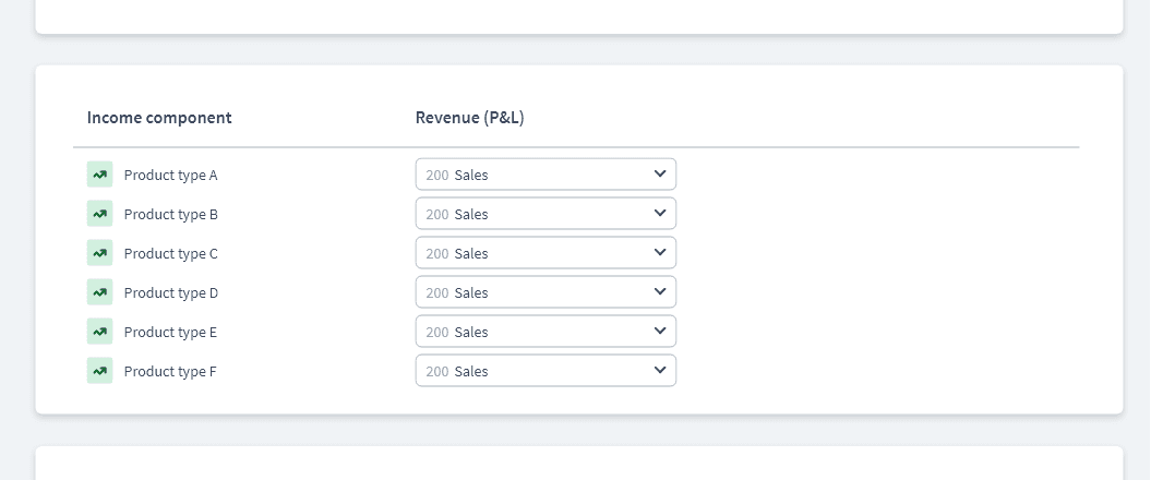
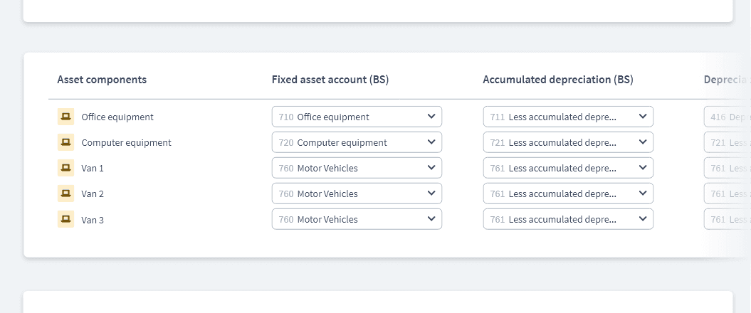
The 'flexible mapping' options were added on a more detailed screen. This could be skipped in the 'new plan from Xero' path as a perfect matching could always be achieved. It was required for the 'connect an existing Brixx plan to Xero' path as perfect matching was unlikely to be achieved automatically and needed user input:
Simplest 'flexible matching' case - one to one
Many to one flexible matching
Matching multiple related accounts per category. An asset such as office equipment would have multiple Xero accounts to handle it's value, Balance sheet depreciation, P&L depreciation and losses. We designed the system to automatically complete these complex cases.
Upon completing the flow, the Brixx plan would be setup and Xero transactions fully imported to match to the forecast:
Users could then visit the newly created Xero management tab within their model to handle any further syncs or matching changes.
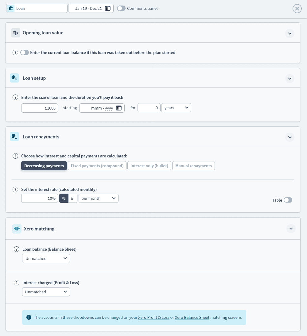
The addition of a Xero connection into Brixx plan had impacts all over the UI. For example, it made sense to show all the matchings within individual Brixx planning components so users could update them as they entered their forecast:
Xero matching section added to the bottom of component forms
User testing - uh oh.
Once we had a basic end to end experience working, we pushed it out to our beta group to begin the testing phase.
And a good thing we did. 😱
When our users started trying the new integration we were inundated with problems.
Here were a few:
Users had 10x more transactions than anticipated, blowing up our API rate limits
Xero had many more ways of entering data into their systems than had been documented in their APIs and weren't captured by the import
Some data inexplicably would never import
Although it was a beta, it was critical we kept our testers on-side during this rocky period so that they didn’t lose interest or confidence with us. I worked with our product manager to keep in regular communication with our testers whilst we worked through the technical problems.
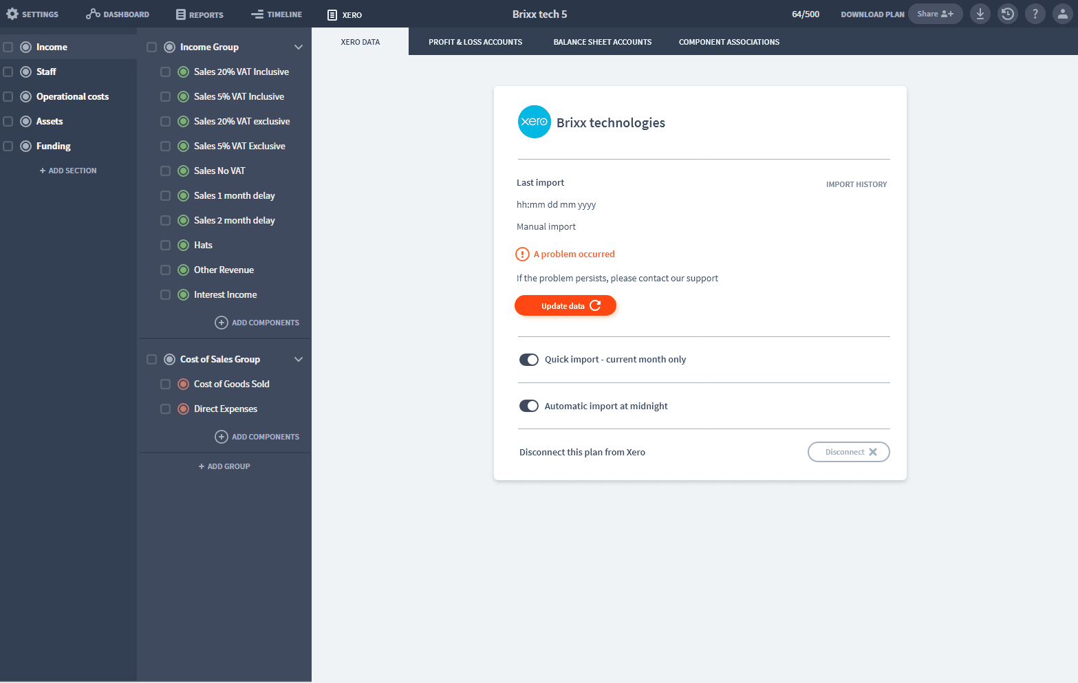
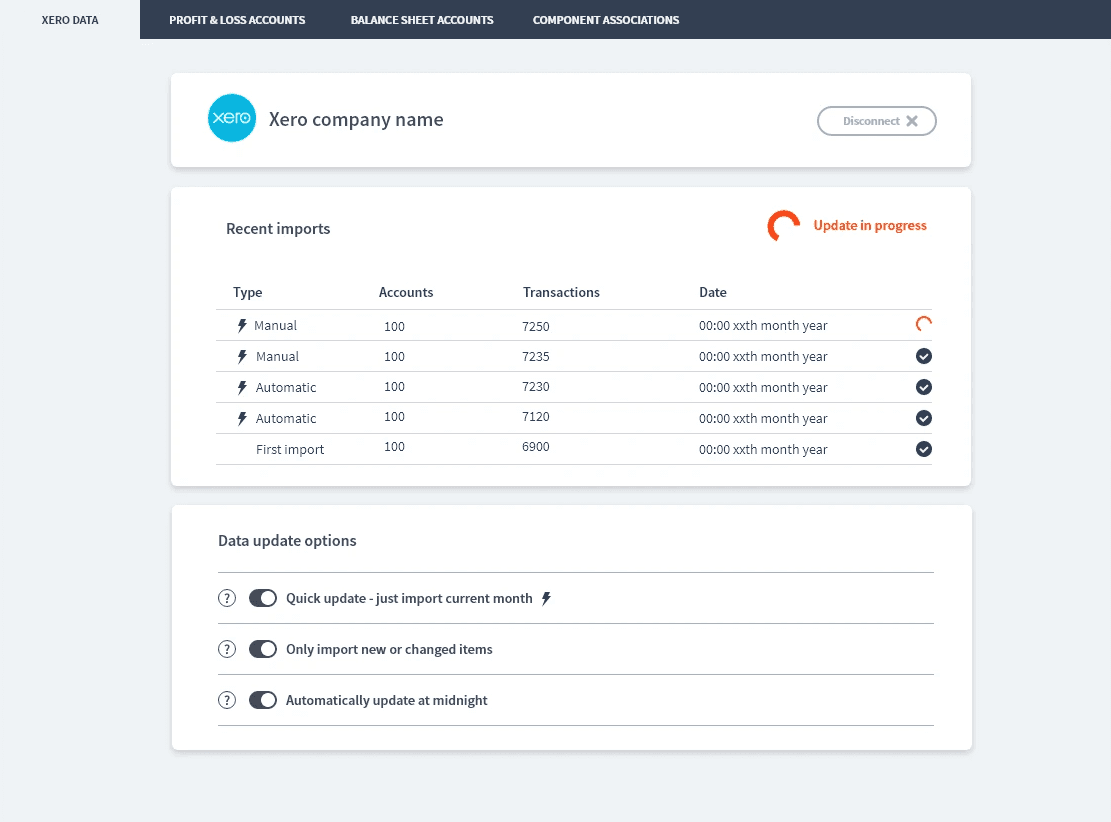
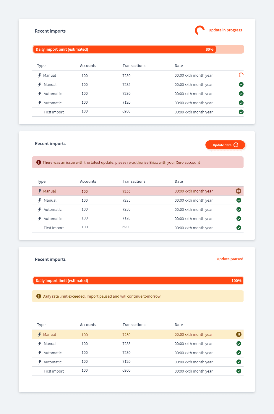
It was also clear that we needed a more robust import page that could help diagnose and correct any issues - keeping the user informed.
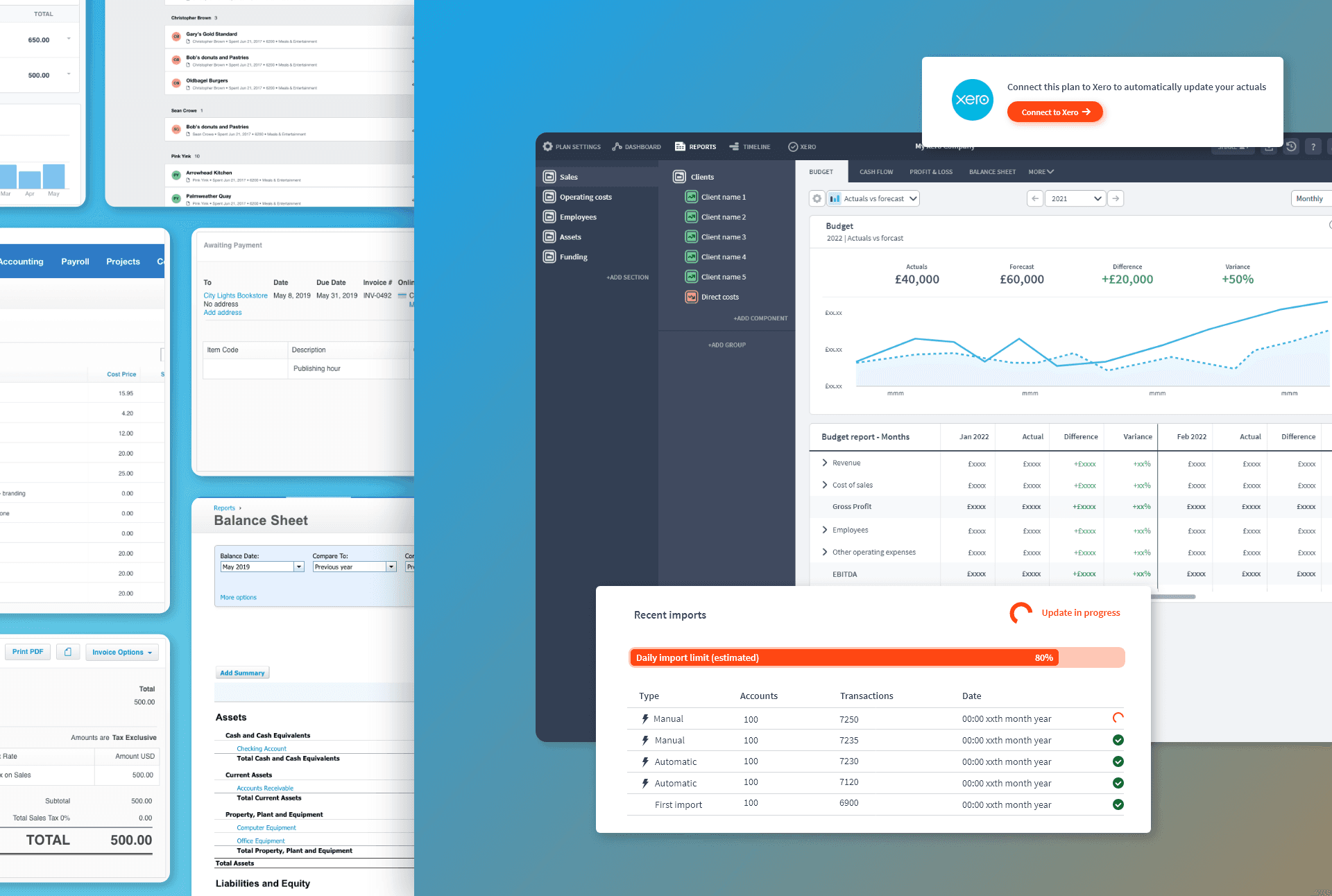
I redesigned the Xero import page to provide more information about historical imports and sync attempts.
Crucially, the screen was re-designed with a number of different states in mind to handle the issues we'd encountered. Some issues like API limits couldn't be overcome completely but could be handled more elegantly so that they didn't completely fail.
Other issues needed the users input, such as when API authorisation tokens reset or were lost for whatever reason and the user needed to re-authorise their account to continue.
Learnings and outcomes
The beta testing process was a tough learning experience and in hindsight there were definitely areas we could have simplified to reduce the risk of these errors coming in. We took note of these in our post-mortem for our future integration projects.
However, we maintained excellent relationships with all our beta customers despite these issues and they spoke highly of our responsiveness and the speed at which we addressed the problems. We did overcome the issues, were approved by the Xero integrations team and launched the product expansion to our entire userbase.
When the integration launched to our wider user base it rapidly became one of the top reasons for upgrades - over 30% of subscription upgrades were for this feature alone.
It also drove new sign ups and opened us up to a new audience of accountants who would only work with Xero products. 1000s of business plans were created with the new Xero creation sequence in the initial months alone.
What did our users think?
