How it started
KEY ESG is a SAAS startup for Private Equity companies collecting and reporting on ESG (Environment, Social and Governance) data across their portfolio. It consists of two connected platforms, one for the fund manager and one for the companies.
I joined KEY ESG as they were recruiting their initial team of engineers, product managers and ESG experts. They had built out a proof of concept (POC) to solve this problem which they had been testing with initial clients.
Their clients were keen to adopt the platform to conduct their ESG data collection for the 2022 reporting year. However it had bugs, was missing key features and was difficult to use.
⏱️ We need to rapidly solve these issues to make it fit for purpose as reporting deadlines were approaching.
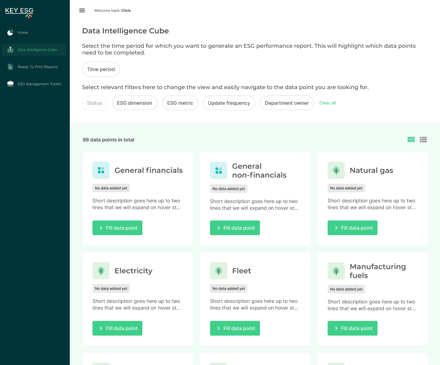
The original KEY ESG POC 'data intelligence cube'
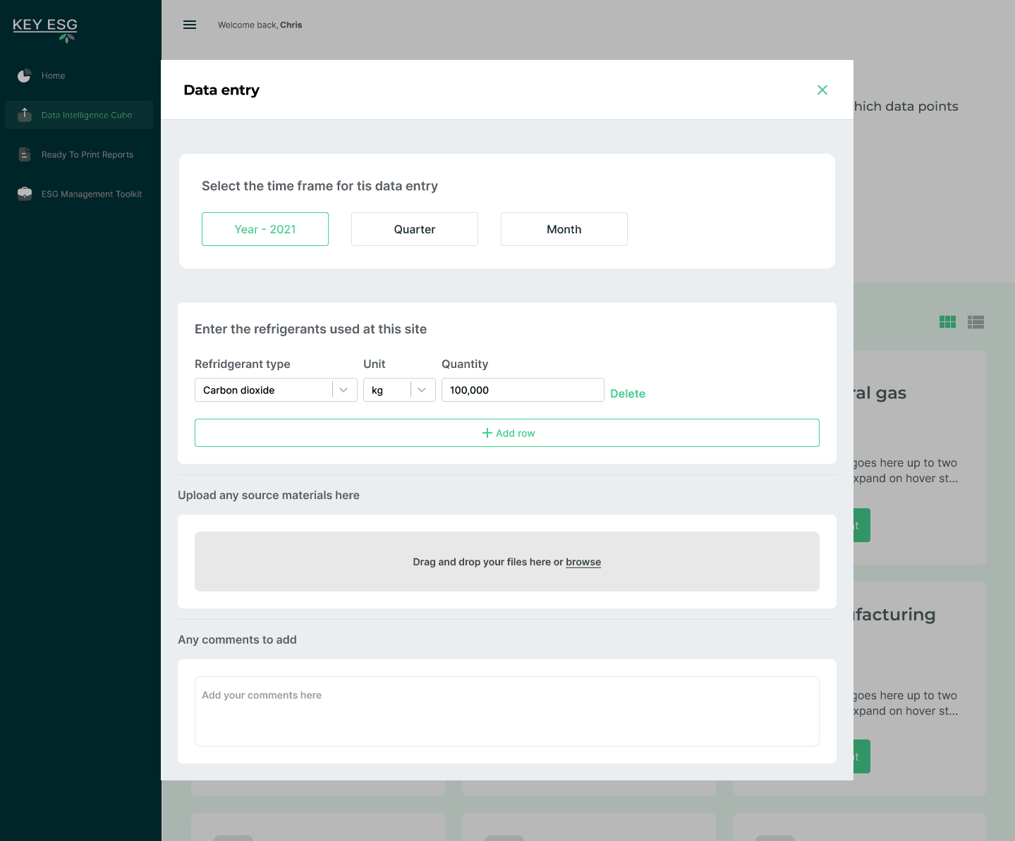
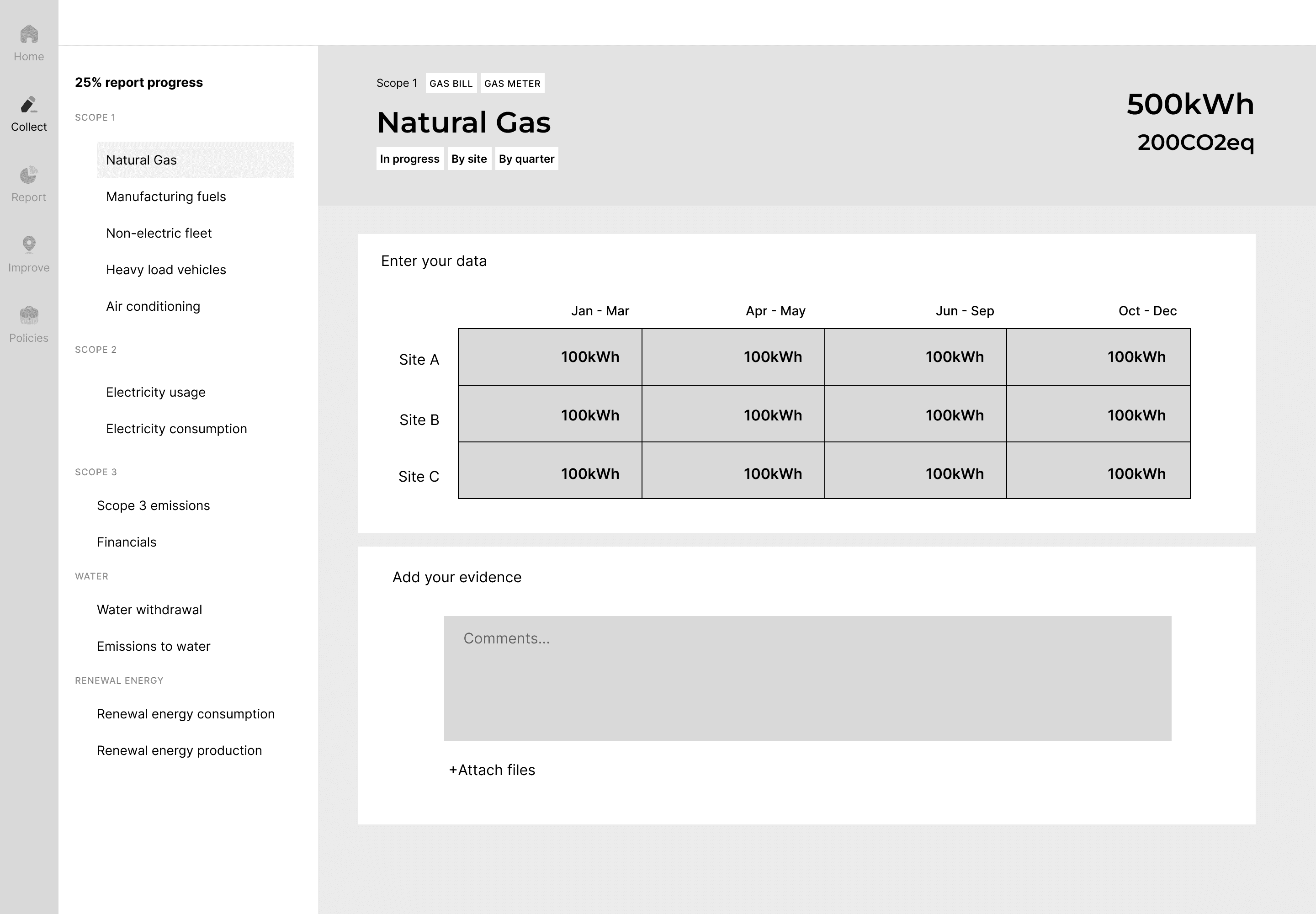
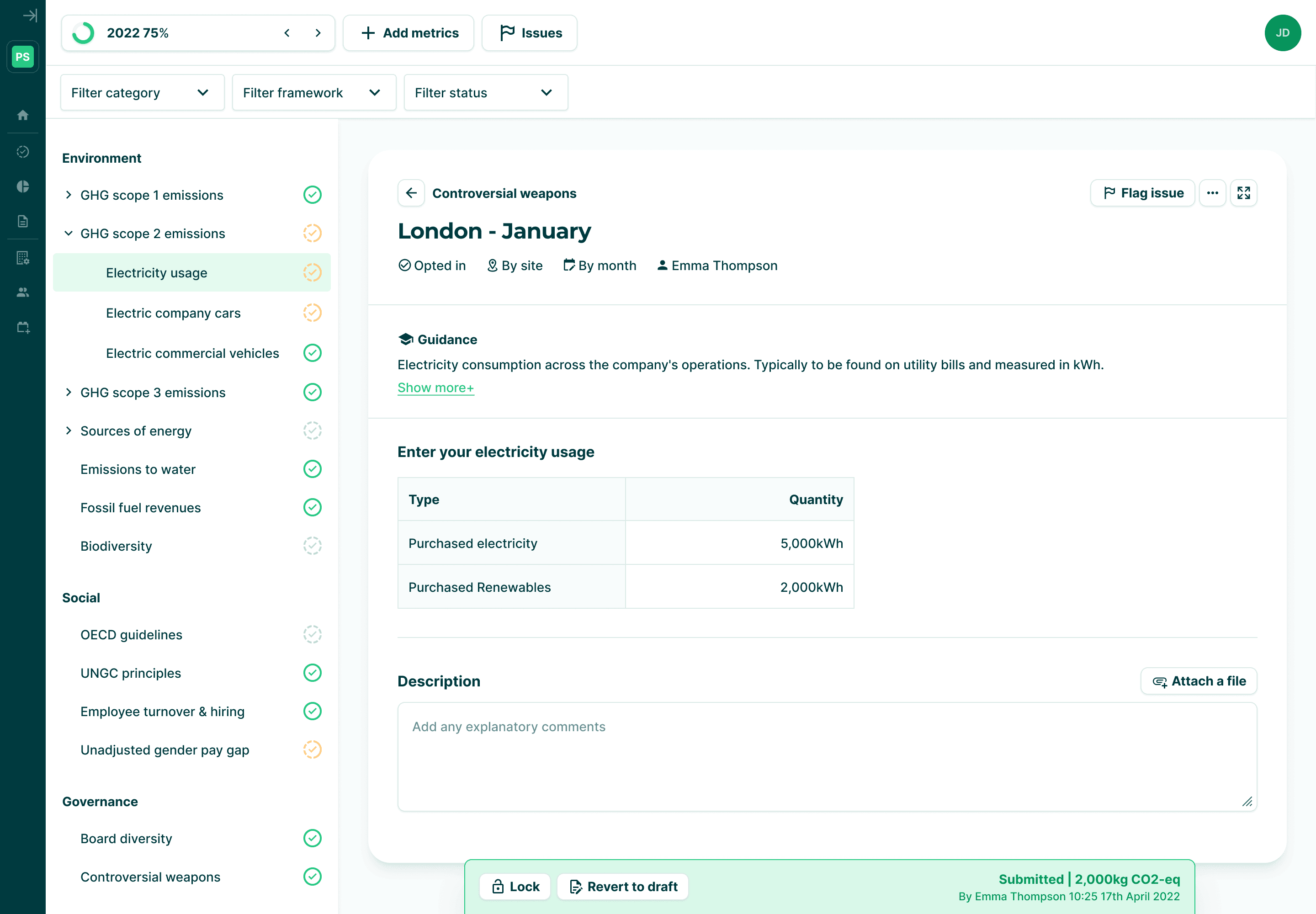
The KEY ESG POC data entry screen.
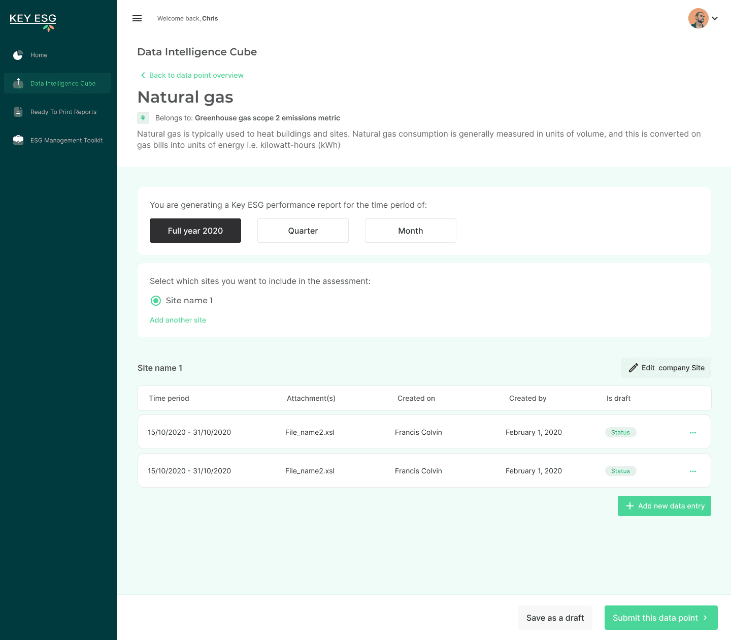
The original POC had usability issues, bugs and missing features
Research
I worked closely with the founders to understand our users, joining calls with our customers and prospective customers to ask questions and gain insight into their pain points.
The same patterns came up very consistently.
Fund Manager pain points 👇
ESG Regulatory requirements are hard to understand
Creating and managing surveys in spreadsheets is resource intensive and error prone
Companies need constant chasing and reminding to complete surveys on time
Data is often incomplete or contains errors
It's hard to make data driven decisions when you can't trust the data sources
Company pain points 👇
No dedicated ESG resource - often falls on the CFO who has other responsibilities
CFO sees the exercise as getting in the way of true value creation
Have to answer similar questions from suppliers, customers, investors
ESG topics are difficult to understand and easy to misinterpret
Getting the data is often difficult and sometimes even impossible.
Data owners could be in multiple departments across the organisation
I met a lot of passionate ESG leads who really wanted to make a difference in their companies but were clearly frustrated with how resource intensive ESG reporting is.
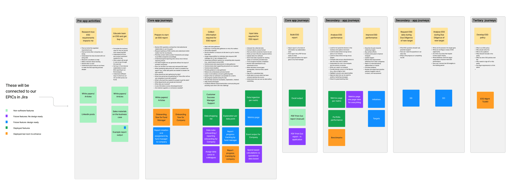
To fully unpack our fund manager user journeys I also collaborated with one of the founders to build a mental model diagram. This enabled us to discuss their entire ESG journey, pain points and the opportunities for us to solve through software solutions.
Mental model diagram
We identified that the core problem to solve initially was around data collection. There wasn't any point in solving issues around data analysis, performance improvements or reporting until users could successfully collect and trust the data.
This was the foundation which we had to get right.
Automating and streamlining the process around sending and collecting ESG data surveys would drastically improve the lives of our users.
However, the POC was not yet succeeding:
😞
Fund managers had no visibility on what was being collected and how each company was progressing.
😞
Company users had no guidance on how to get started or which metrics to complete for their fund manager.
In addition, there were usability issues such as cluttered and confusing data entry screens, technical jargon like ‘data intelligence cube’, unclear navigation and others.
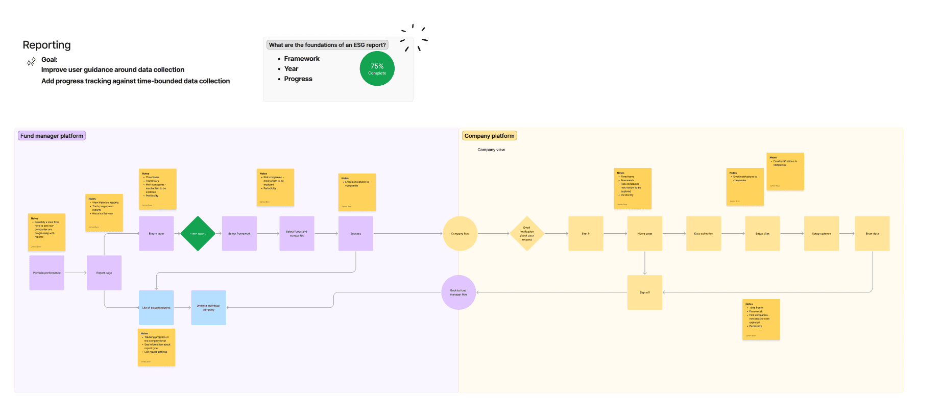
With client reporting deadlines approaching, there was no scope for a complete redesign of the experience, I needed to work with what we had. I ran a workshop with the founders and engineers to map out how these users flows needed to work.
Flow diagram mapping the interaction between the fund manager platform and the company platform
This session helped the team arrive at a consensus on the steps, content and actions throughout the journey. It also helped me understand what was technically feasible within the given timeframes.
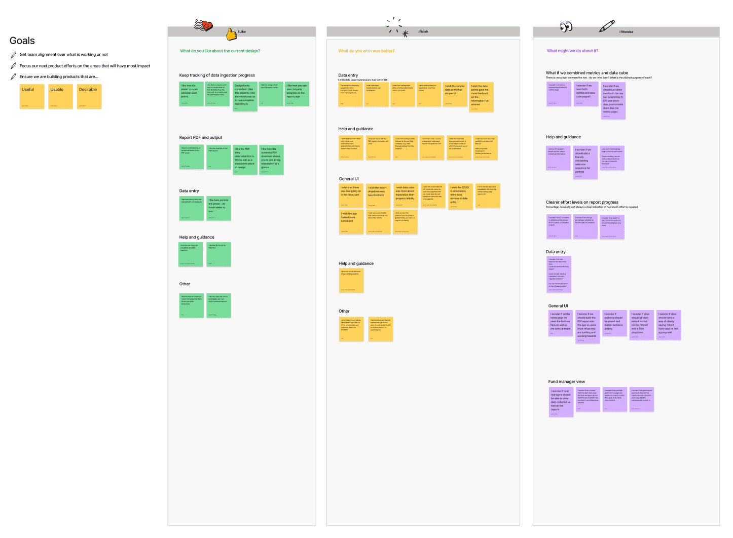
I also ran an ideation session on the company platform data entry area to elicit the teams thoughts and ideas. I used the format ‘I like, I wish, I wonder…’ to help the team consider the problem from a different angle. I grouped them into themes and married them with our user research to help focus ideation around solutions.
🤔 How could we make the company platform a more guided, less overwhelming experience?
Ideation workshop: I like, I wish, I wonder…
Moving into sketches and wireframing, I rapidly generated a wide range of ideas and approaches. I regularly sparred with members of the team to push ideas forward and cull the bad ones.
Exploration: A sketch showing related data entries grouped together for bulk entry and better visibility on data
Exploration: introducing relevant topics to the user bit by bit, to be less overwhelming and easier to digest.
The first iteration
Ultimately, some of the more ambitious concepts had to be rejected in the short term due to the timeframes of the project. There were other limitations as well, we knew that new ESG frameworks were coming with hundreds of different questions and metrics to track. We couldn't lock ourselves into a rigid structure (even if it was a better overall UX for this particular experience) as it would prevent the product from scaling in future.
For our first iteration we adopted:
Moving to a list based UI for quick navigation and readability of the required data points
Data point list automatically focused on the fund manager requirements
Progress and status displays to help users keep track
Cleaning up the technical jargon and language to make the app friendlier and more helped
Enforced periods for monthly/quarterly/annual entries
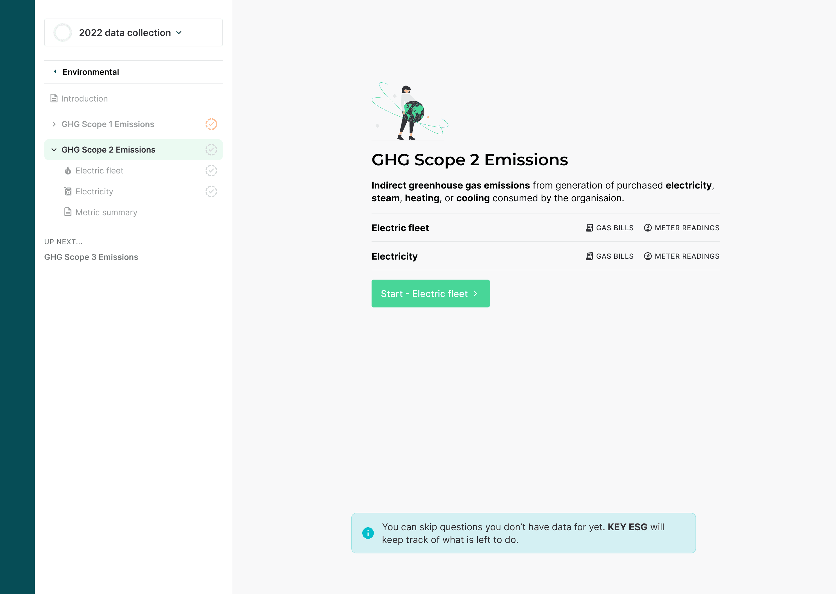
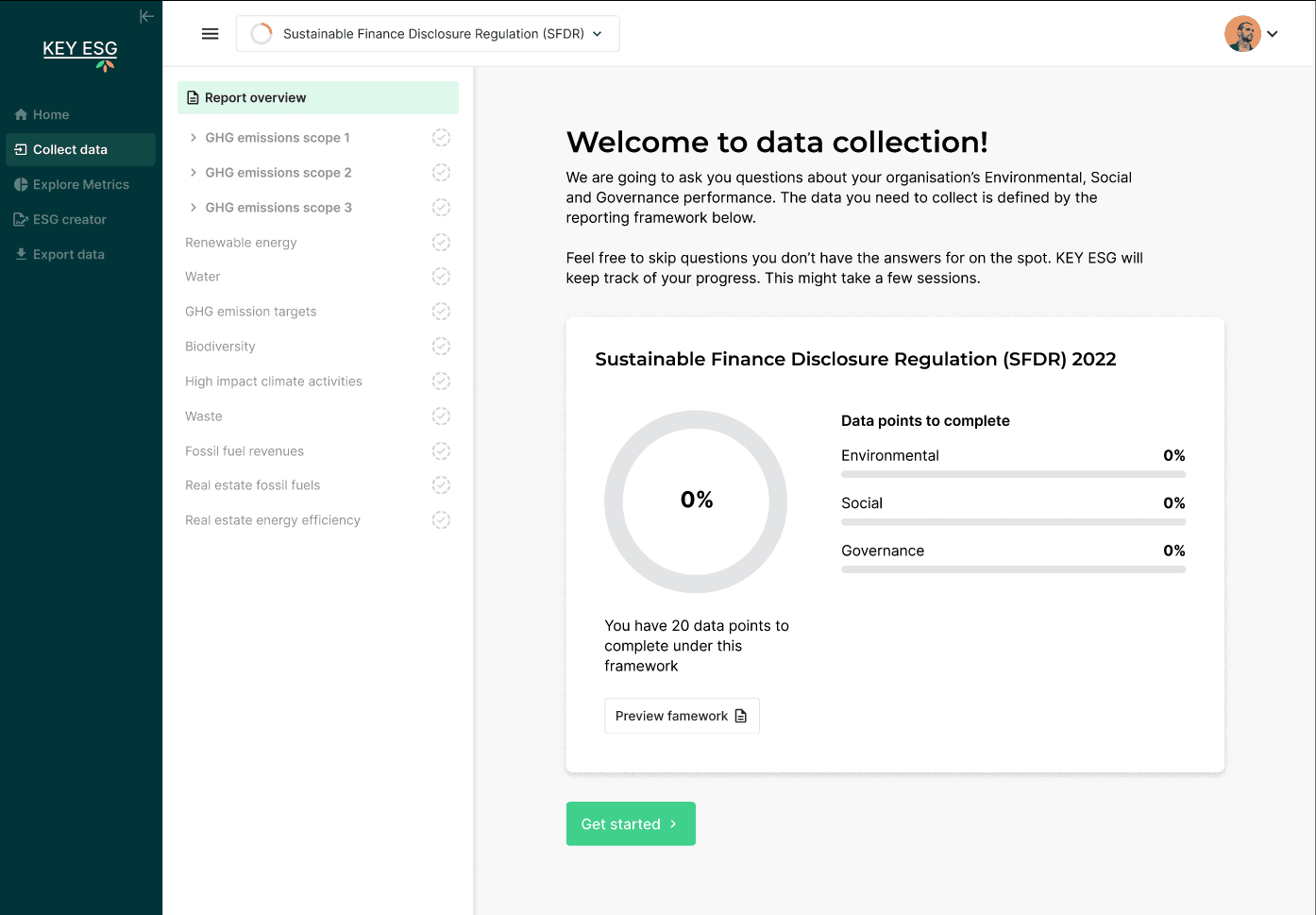
The first iteration of our data entry area aimed at solving our immediate problems and making the product ready for real-world use
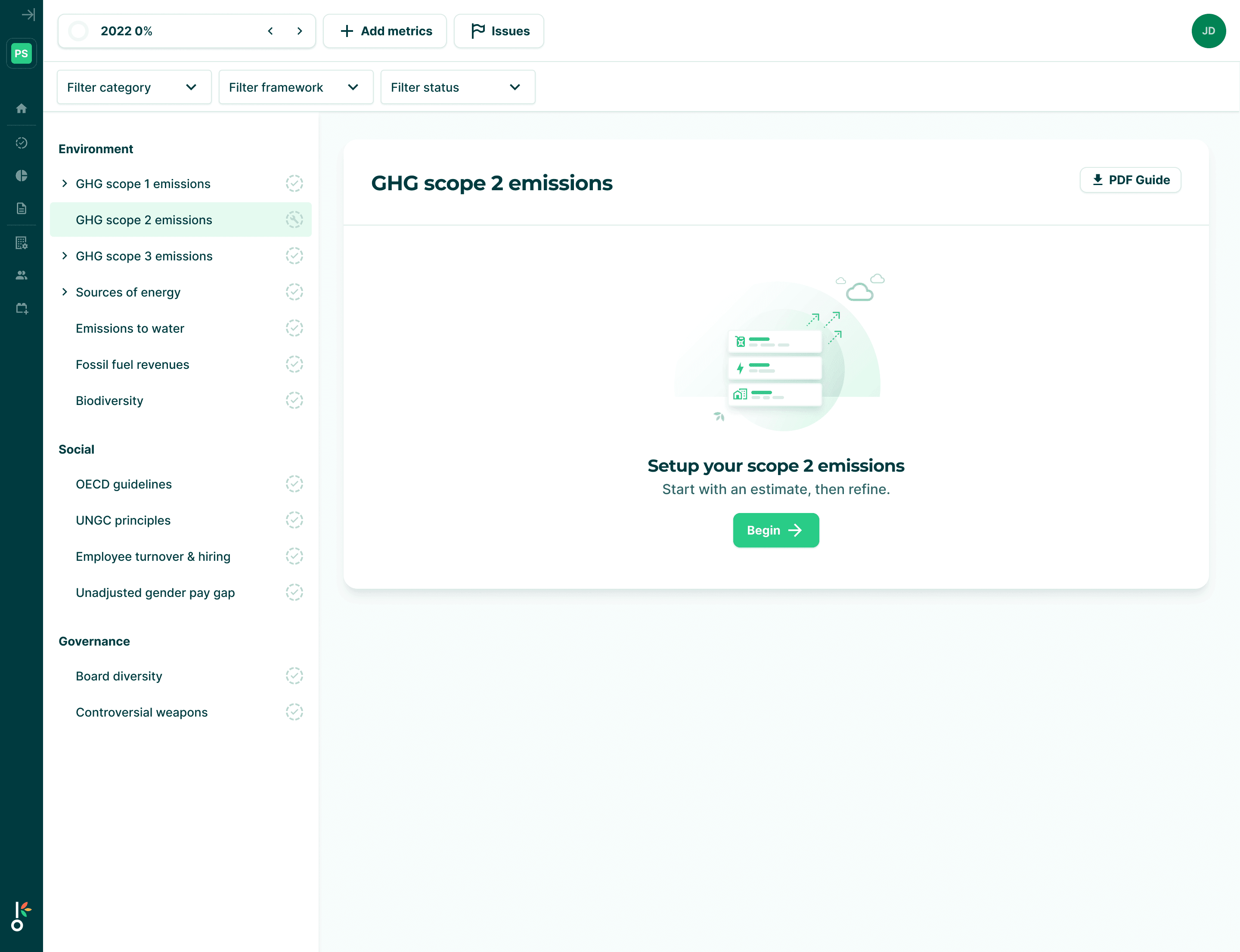
I solved the existing usability issues using a new side panel navigation bar, adding status and progress tracking.
Overall, these changes would improve the navigation issues and reduce some of the clicking in and out of screens. The right-hand panel would mostly remain the same as the original POC meaning we could make this change rapidly.
I still had concerns that the core data input UI from the POC also needed substantial improvements. There was a lot of clutter and some of the data entry inputs were unnecessarily arduous. I identified low effort, high impact improvements that could be included but any larger changes would have to wait.
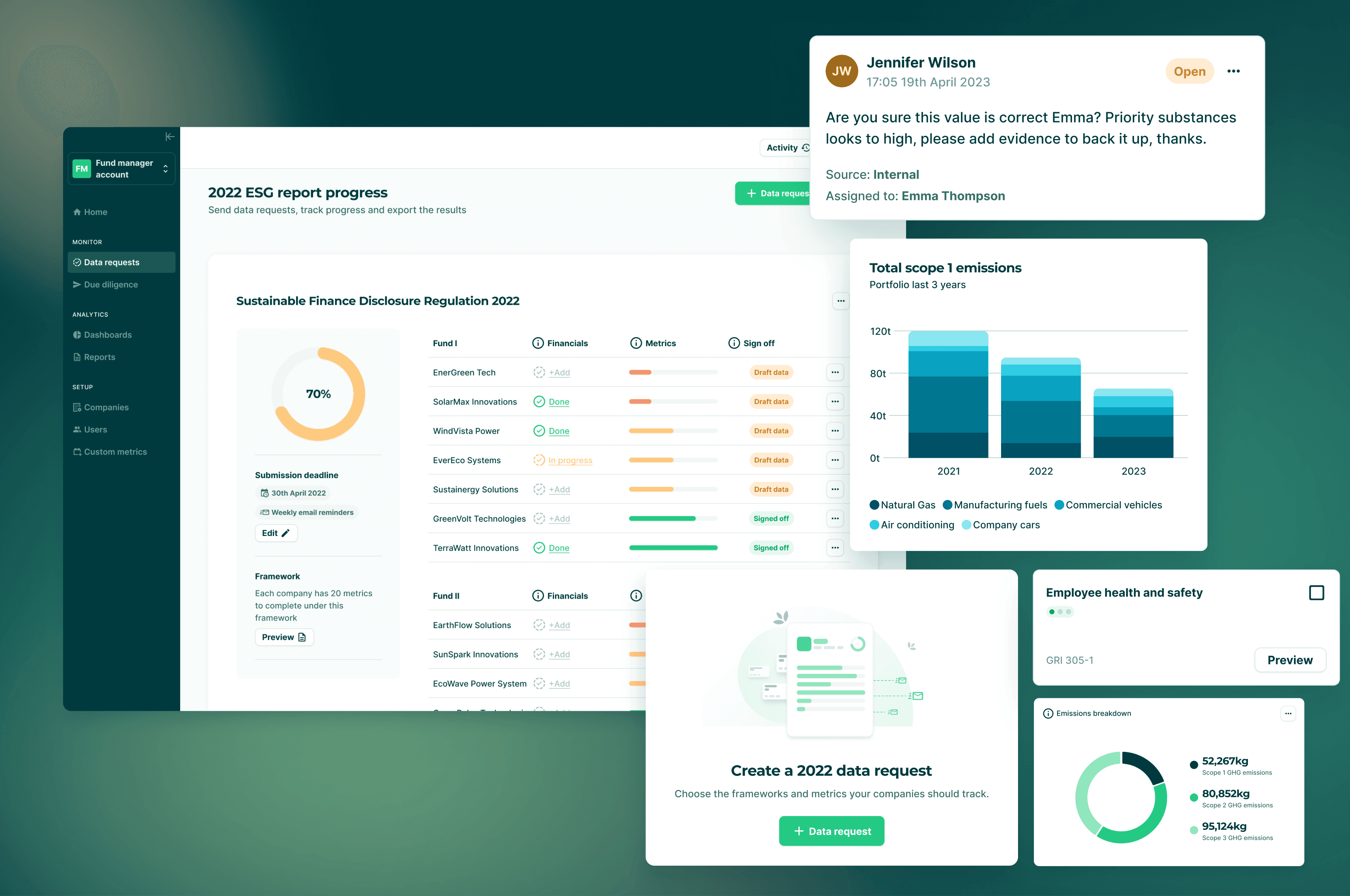
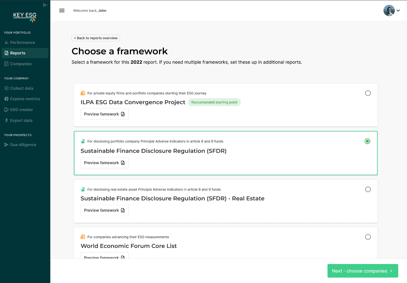
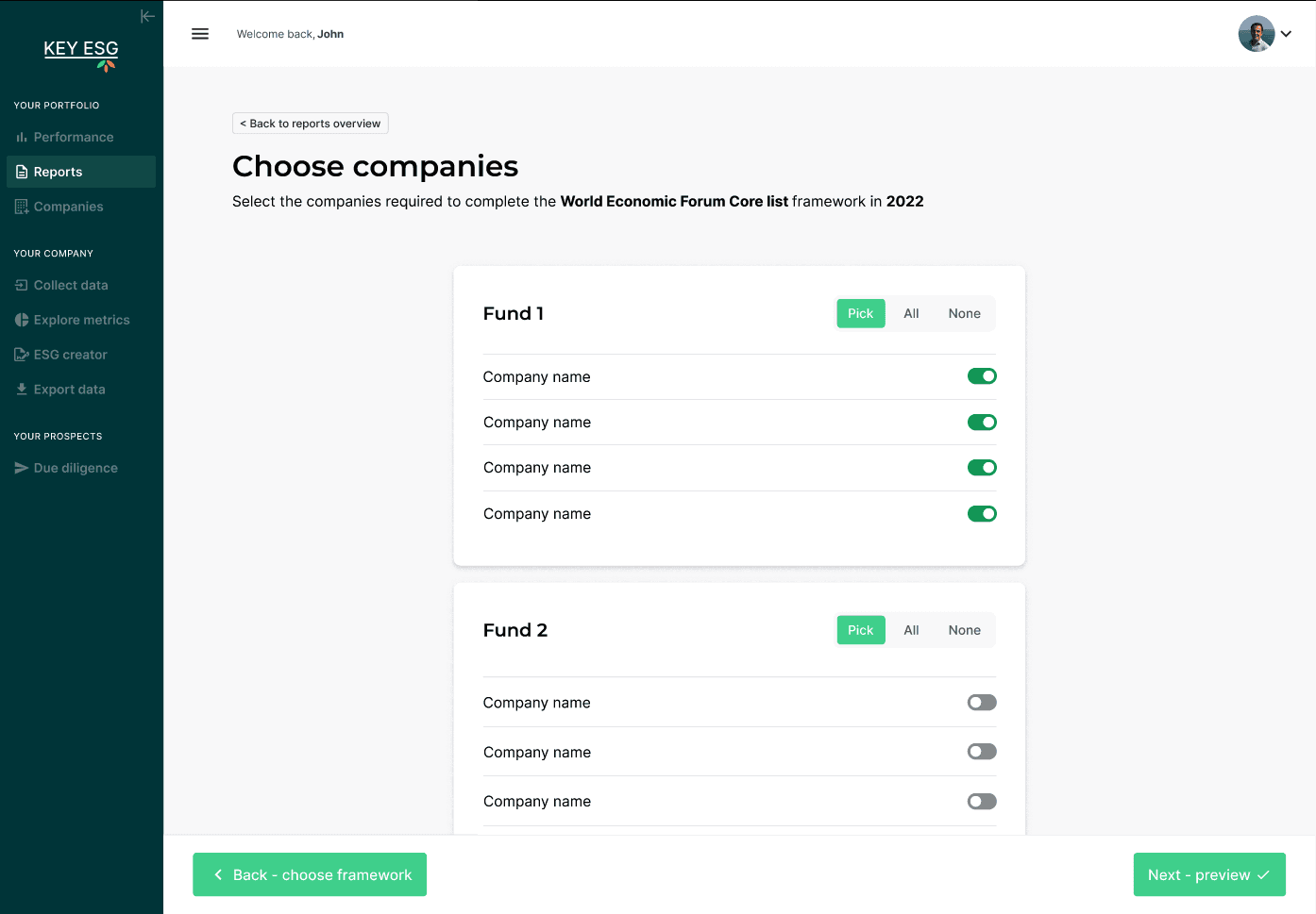
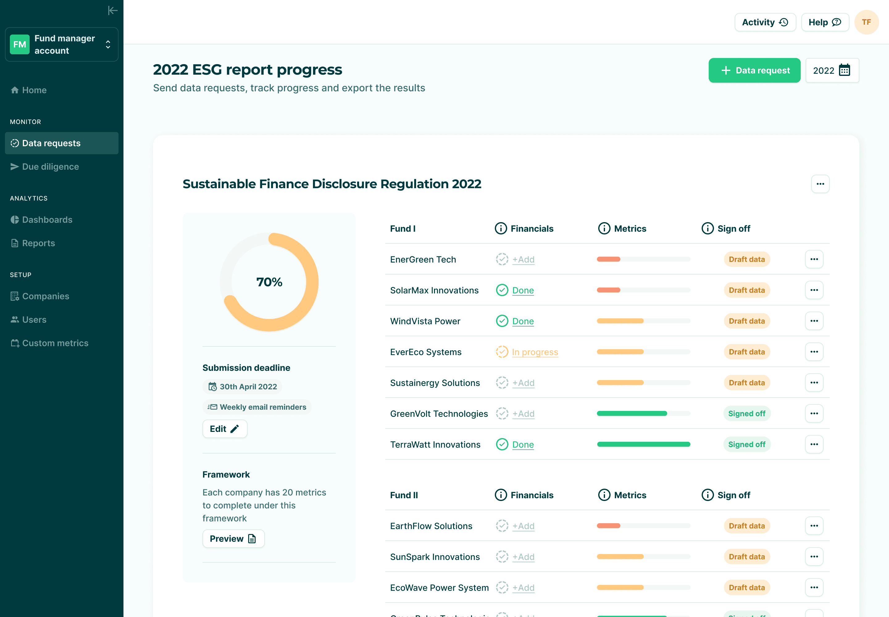
I also prototyped a new flow for the fund manager platform that allows them to create, send and manager their data requests across their portfolio.
The fund manager flow enabled them to set ESG framework collection requirements across their portfolio
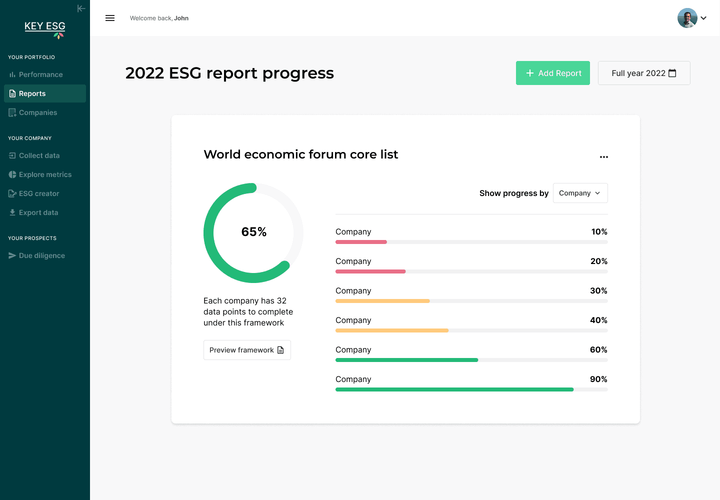
New fund manager area with a data request setup tracking company progress.
New fund manager area with a data request setup tracking company progress.
Usability testing
My main concern was the company platform where the majority of user activity would occur. I ran 5 rounds of usability testing with the new changes to company platform. Each round went through 3 tests to examine different areas of the experience:
🧪 Setup and configure your London Office
🧪 Enter the electricity usage for one of your sites
🧪 Import a spreadsheet of employee salary data
Some of the UI issues I was concerned about did come up in testing but it wasn’t as problematic as I had feared and gave us confidence to move forward.
I suspected that they could become annoying once a user had to complete a full ESG reports worth of data - something that is difficult to test for outside of real world use. I made sure this was considered for our upcoming roadmap.
Overall it did validate that the new approach was clear and easy to understand.
The team was also excited for new UI, the app felt completely transformed with just two sprints of work 💪
Launch outcomes and next steps
Our launch version of the product was used by over 50 companies to collect data for the ESG regulation ‘SFDR’ as well as the Greenhouse Gas Protocol carbon emissions. Through surveys and direct conversations we found out that the process was far easier than the existing method of spreadsheet capture and email communication.
Our initial customers quickly become our best advocates:
“KEY ESG enabled Pollen Street to centralize all portfolio carbon data in one platform. The rapid onboarding allowed all our companies to collect and report on the required SFDR emissions data within 6 weeks.
We could not have moved this fast without KEY ESG. Our portfolio companies love how easy to use the platform is and have already mentioned they want to use it for their own internal ESG processes.”
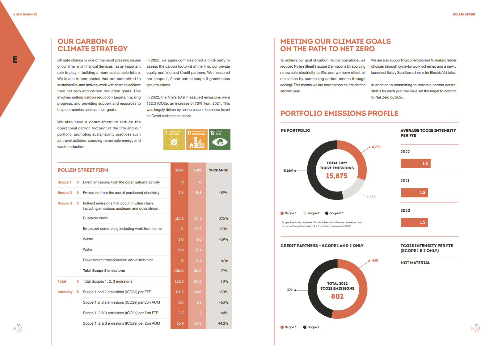
Sample page out of one of our clients 2022 annual ESG report created off the back of data collected within the KEY ESG paltform
Product evolution over 2023 and beyond
We continued to evolve the product in collaboration with our users over 2023. Our launch product was still quite bare bones and our competitors were ahead of us in functionality.
Users wanted more in-app reporting, analysis and data validation. There were also still unresolved usability issues which we looked to solve when it made sense within our roadmap schedule.
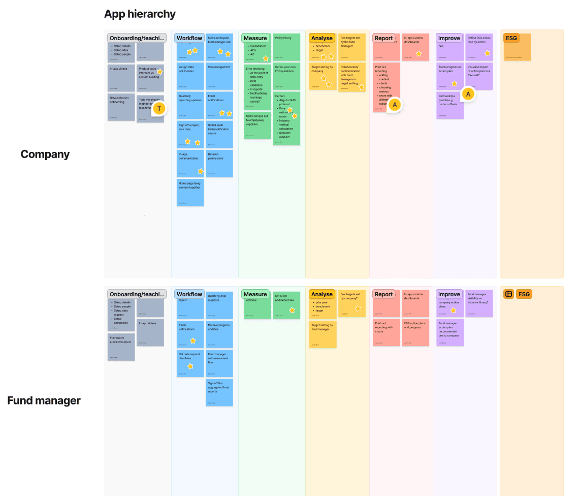
I helped map the information hierarchy of the fully featured platforms collaborating with our newly recruited product manager to breakdown and understand these user problems.
Over the course of 2023 and into 2024 I drove the end to end design behind brand new flows, features and improvements throughout both platforms.
🚀 Company platform
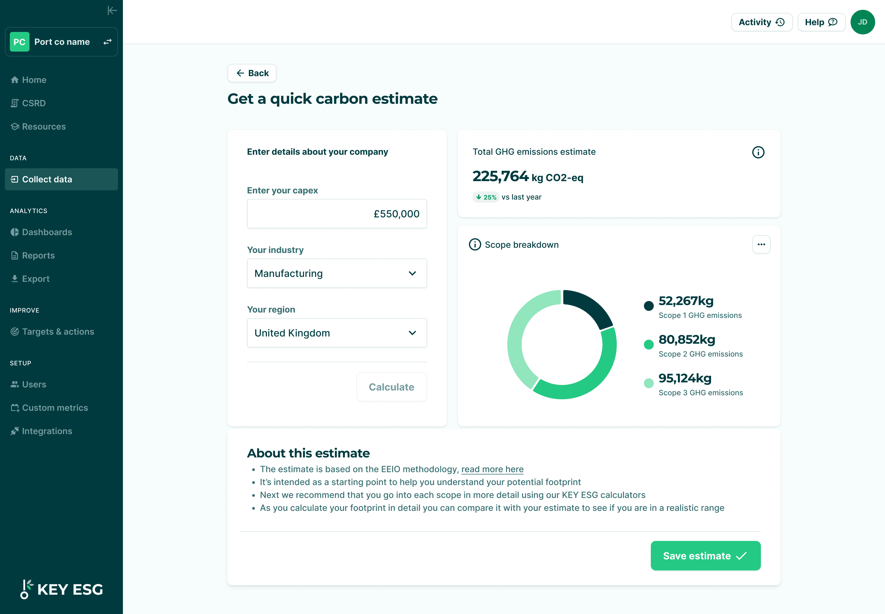
Full carbon emission scope 1,2 and 3 calculators across all methodologies
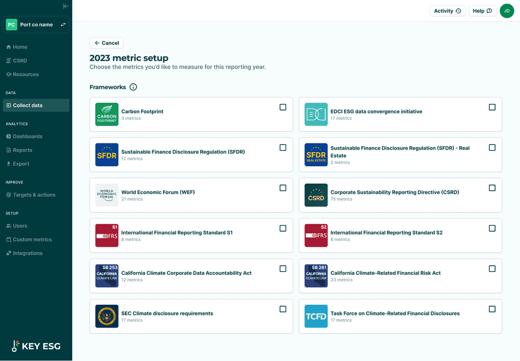
ESG framework and metric manager
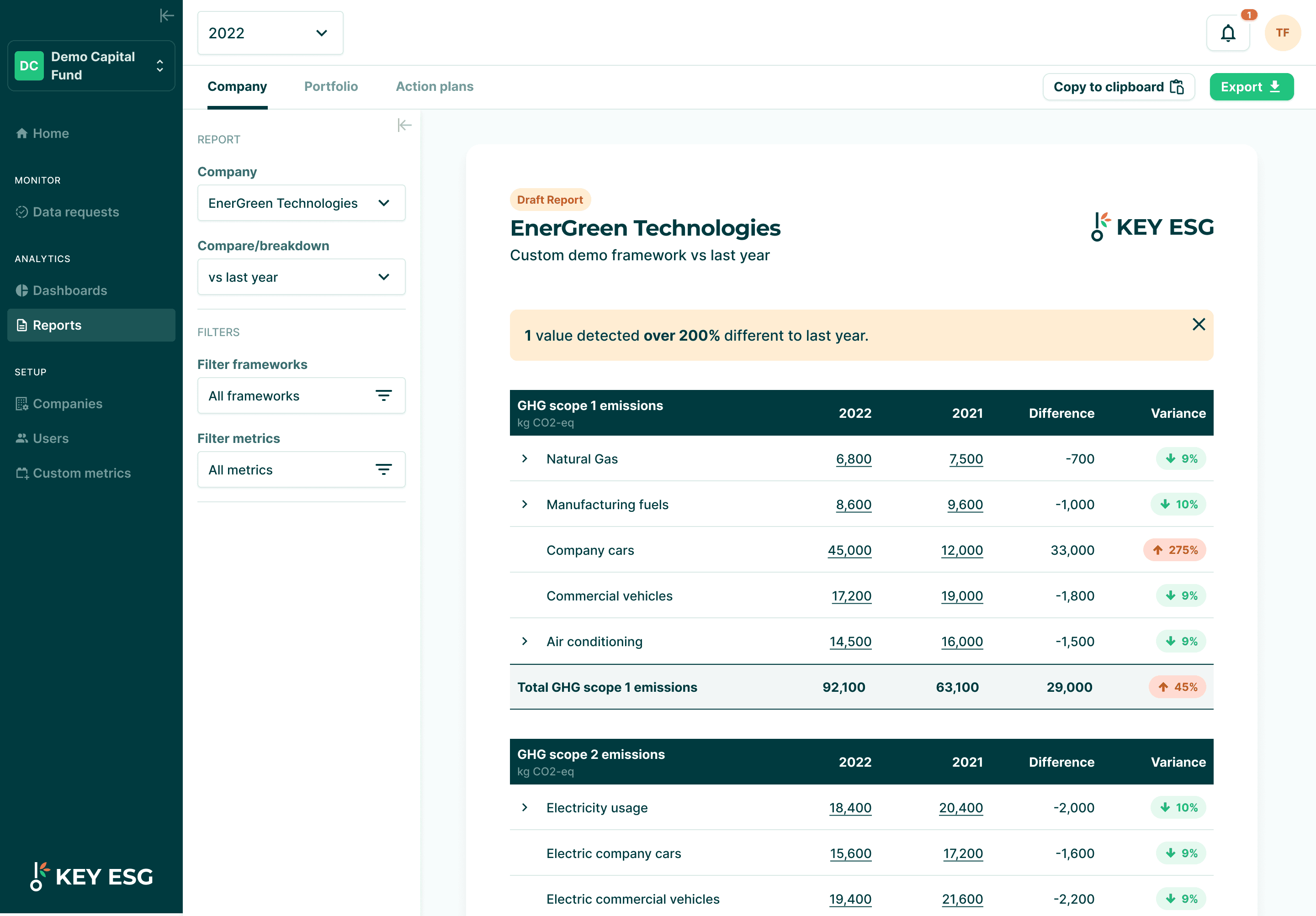
Reporting and analysis area
Targets & action plan modules
User management area
ESG metric creator
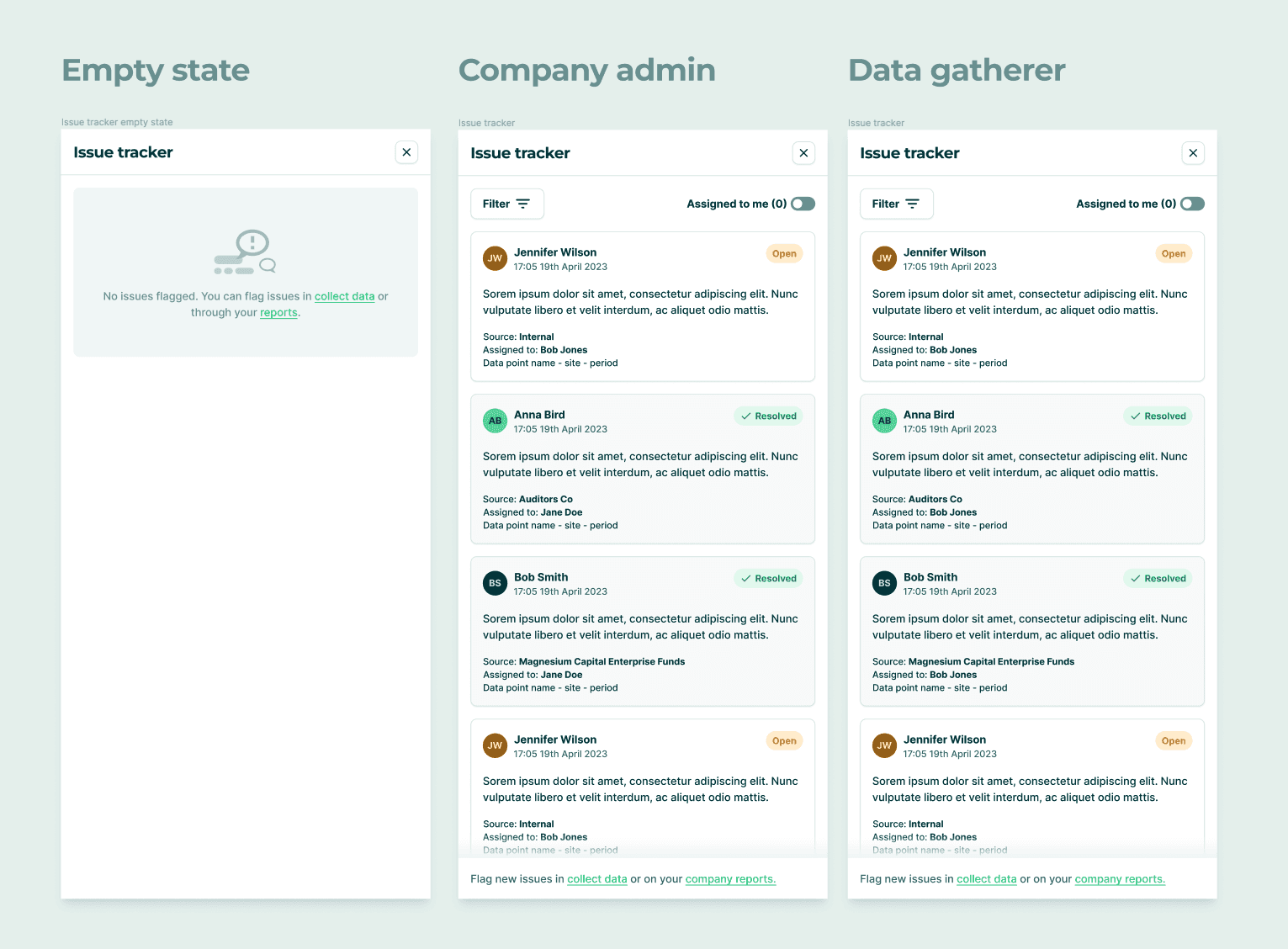
Issue tracker with comments, tracking and resolution
🚀 Fund manager platform
Data request flow and tracking page evolution
Monitoring and alerts
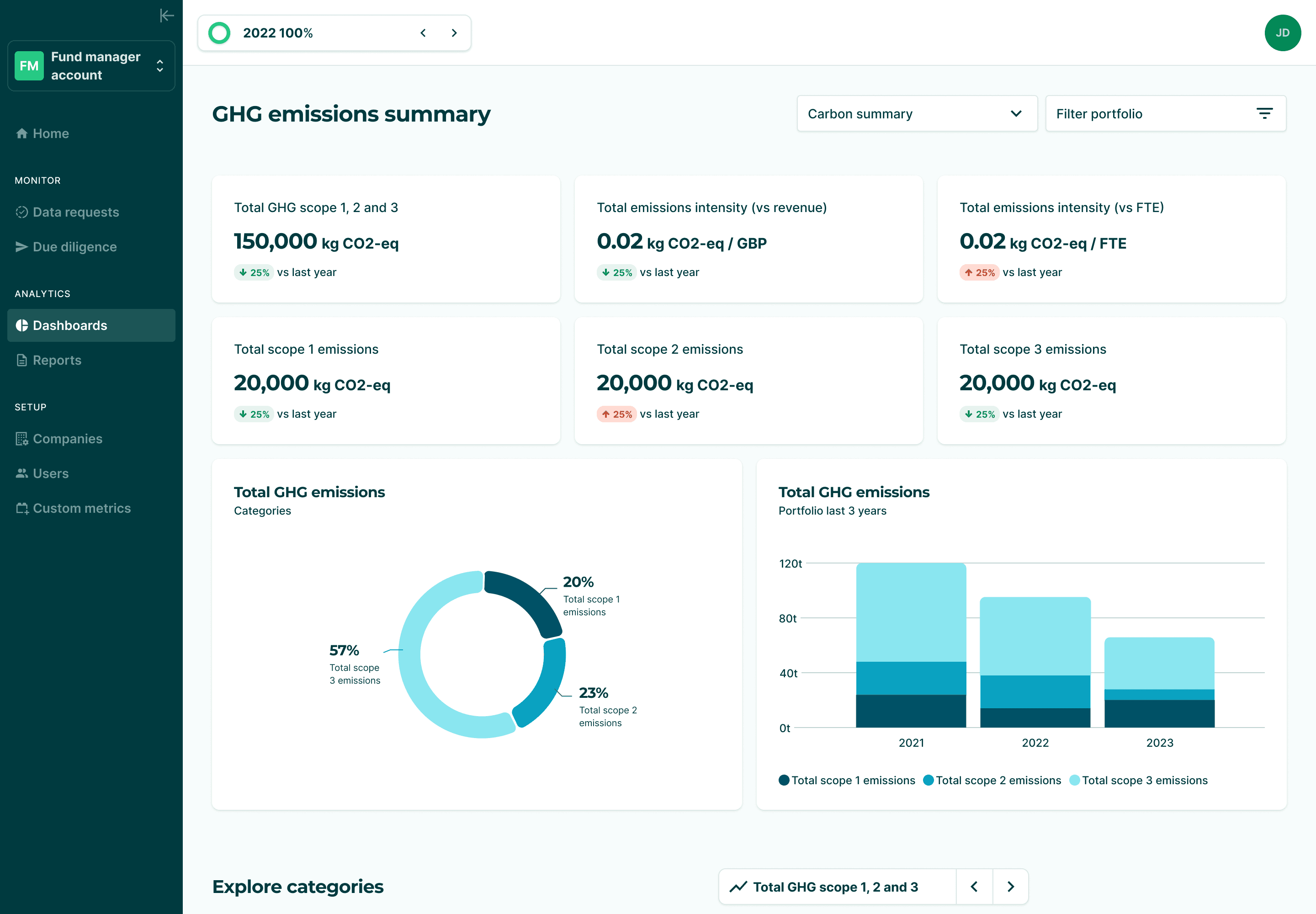
Dashboarding and analysis area
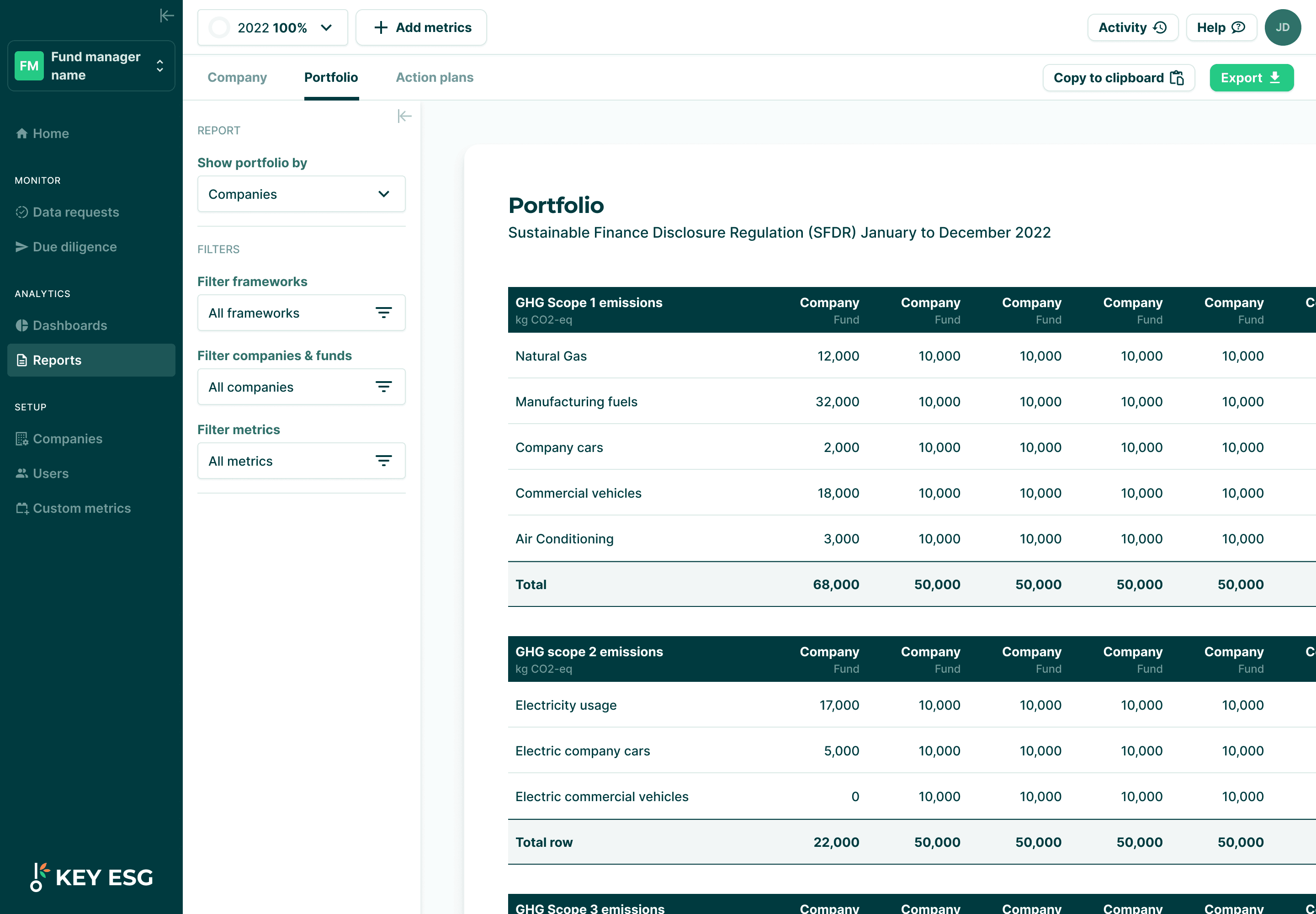
Reporting and analysis area
Portfolio management and switcher
Custom metric creator area
We researched, designed and implemented features at a rapid pace. Often starting with simple MVPs to validate with users before fleshing them out with further iterations.
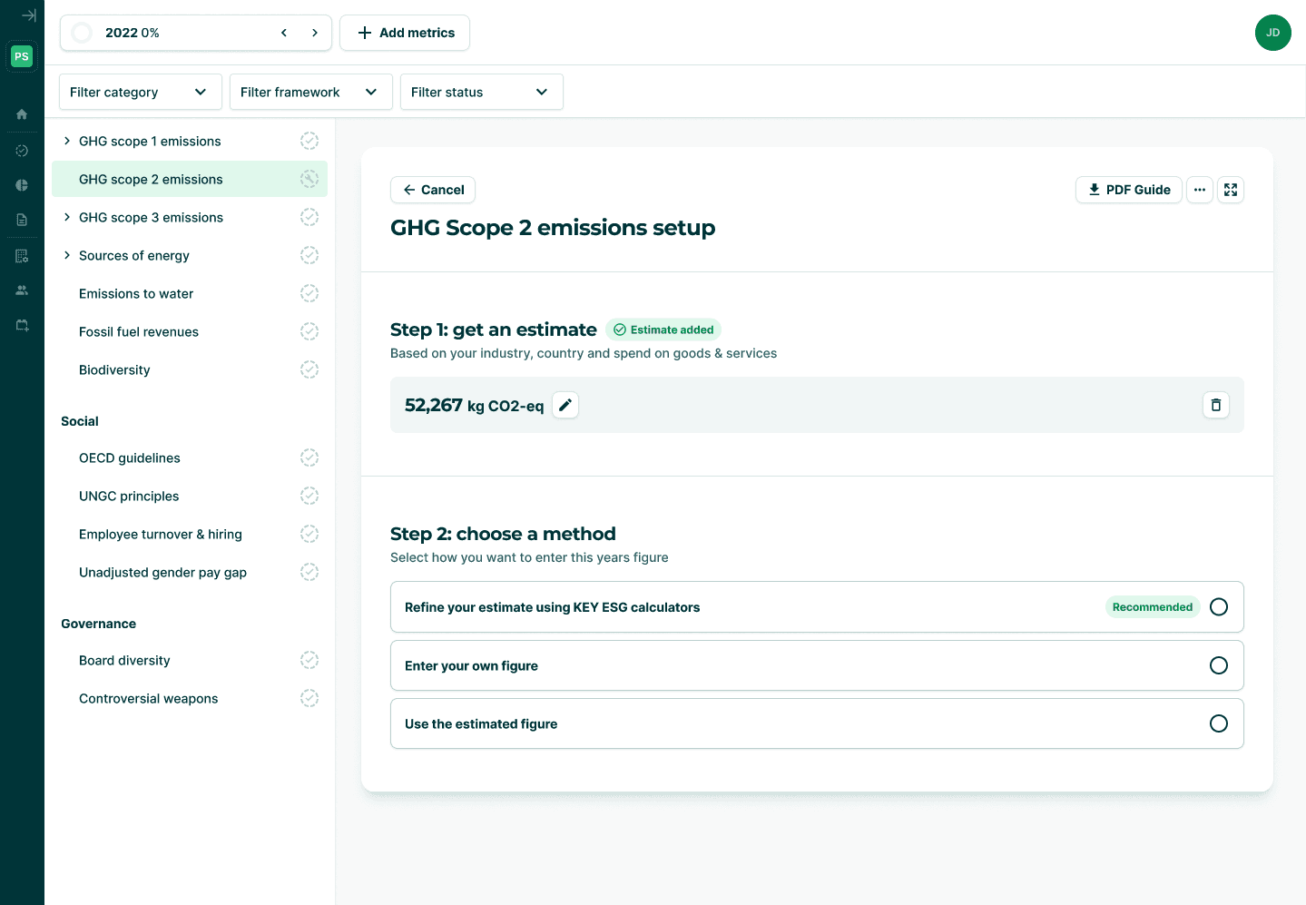
The company collect data area was always the foundation which we iterated on the most and launched a full revamp at the start of 2024.
Company platform screenshots
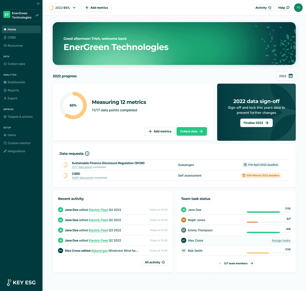
Company home page experience
The interactive prototype of data collection v2 built in Figma and demonstrating all the possible states and configurations data points could be setup in.
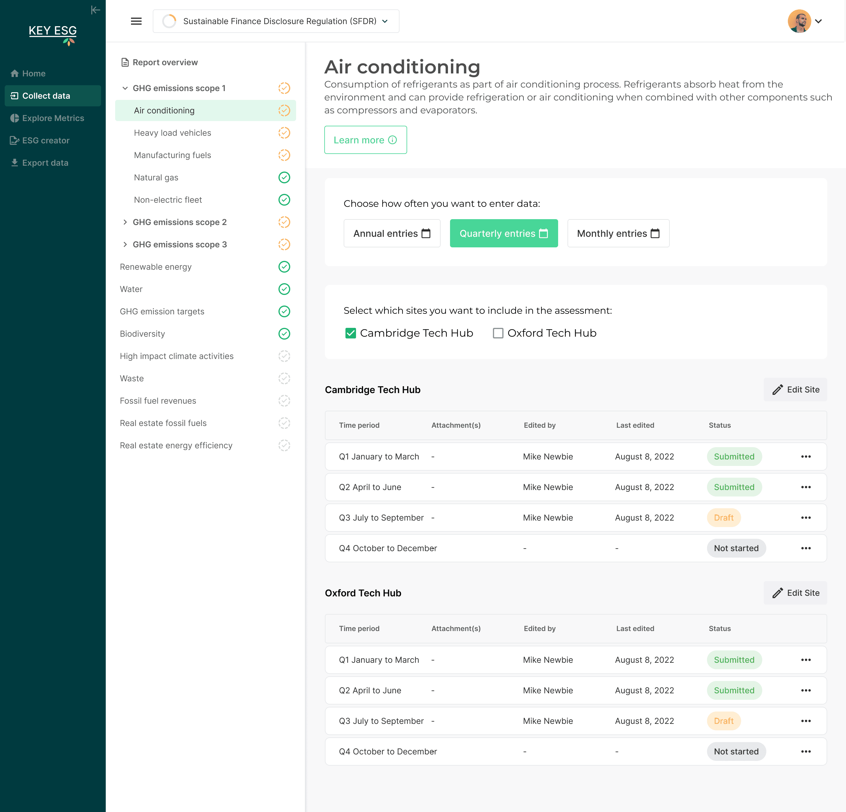
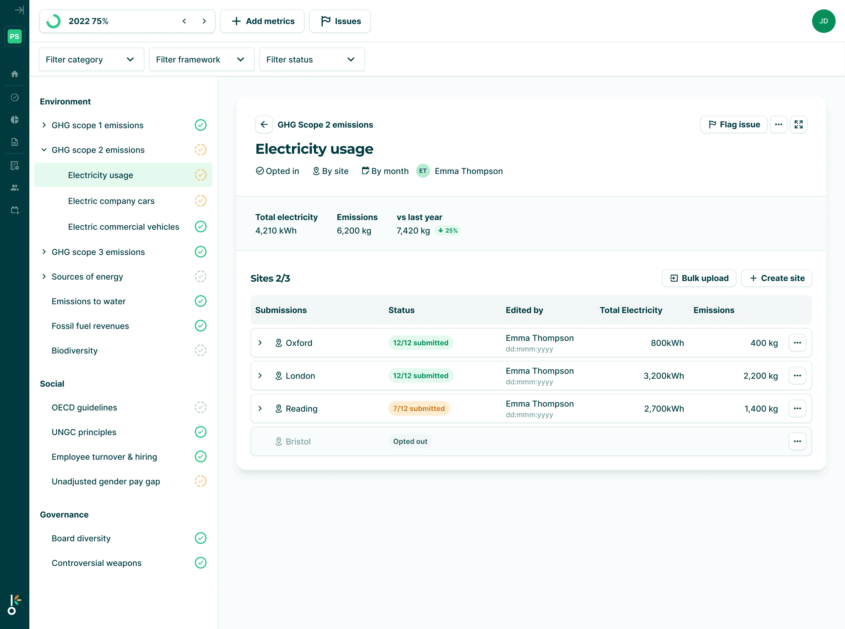
Screenshots from data collection v2
ESG library of frameworks and metrics
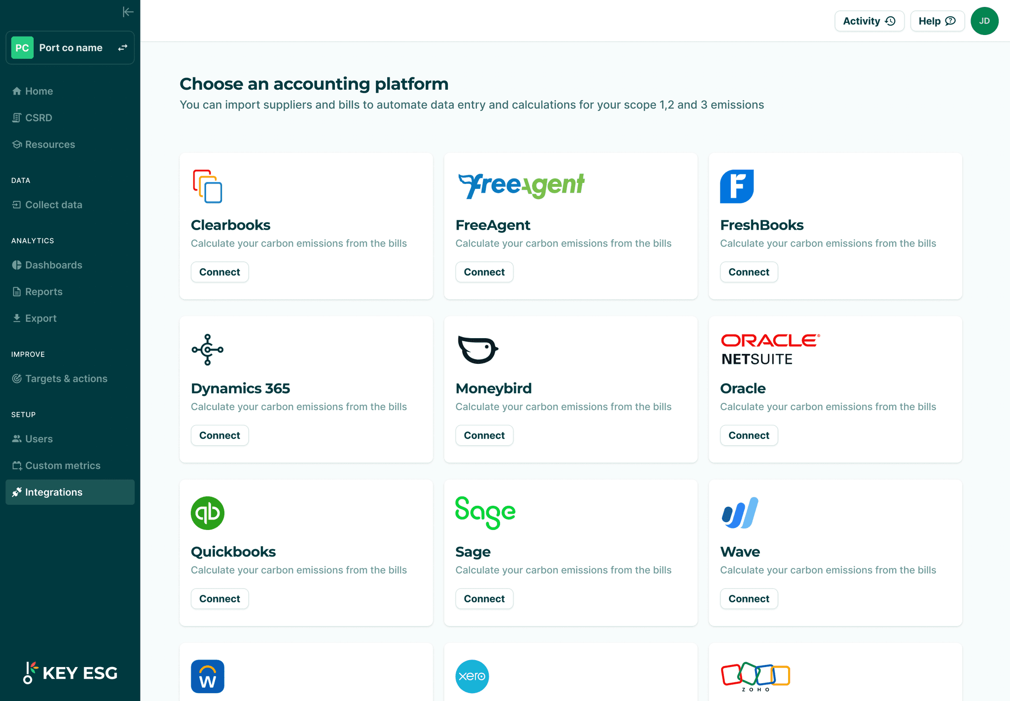
Company platform Integrations page
Fund manager platform screenshots
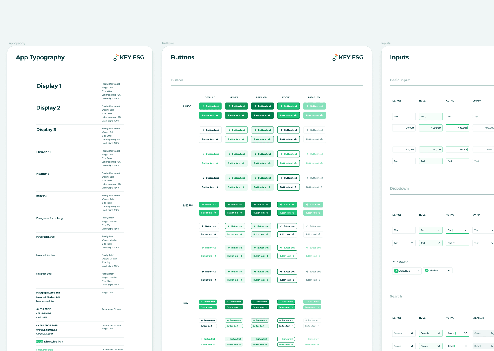
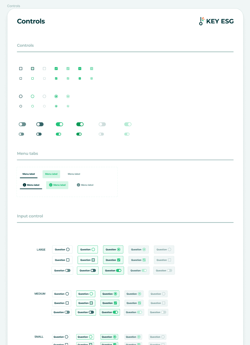
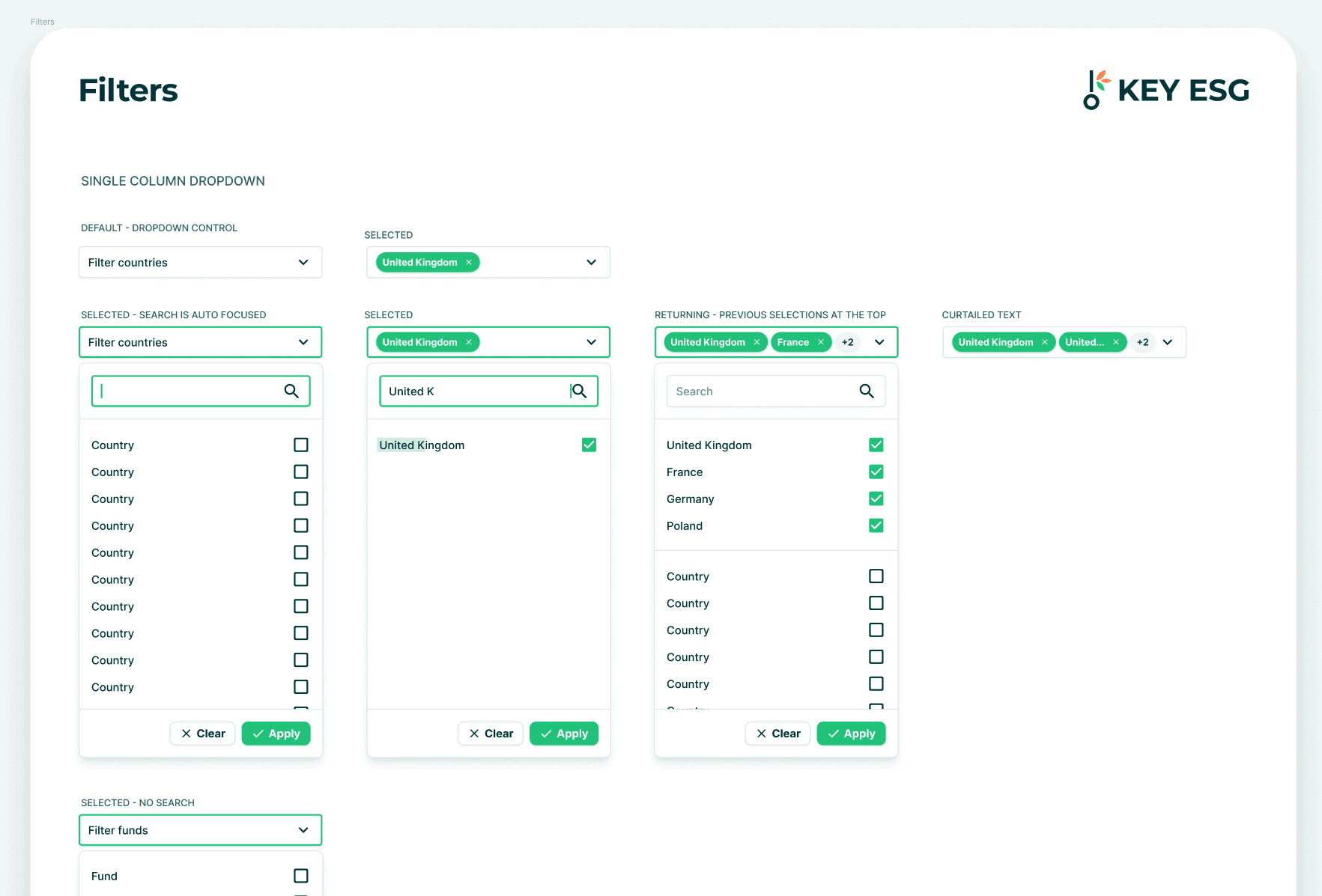
Design system evolution
When I joined the company, the design system look and feel was based on a e-commerce Figma template that was not aligned to the company brand guidelines and contained many un-used components.
It had also only partially been followed by the engineers and so there was a mismatch between the implemented components and the Figma design system file.
I evolved the Figma design system to match the brand guidelines and developed a modern look and feel to help differentiate our product from our competitors who typically had out-dated, clunky interfaces. I worked closely with the engineering team to bring the Figma files and production components into alignment.
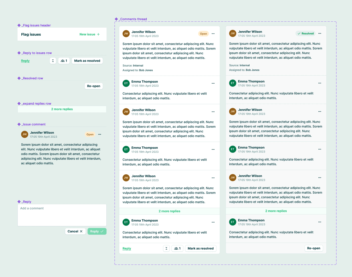
As we added new features, I would update and expand our component base and design patterns pragmatically. For example, the I established the patterns for in-app communication during our 'issue flagging' project:
KEY ESG today
The company continues to rapidly expand it's team and customer base. More case studies will be coming soon focusing on specific projects at this dynamic tech startup!
